
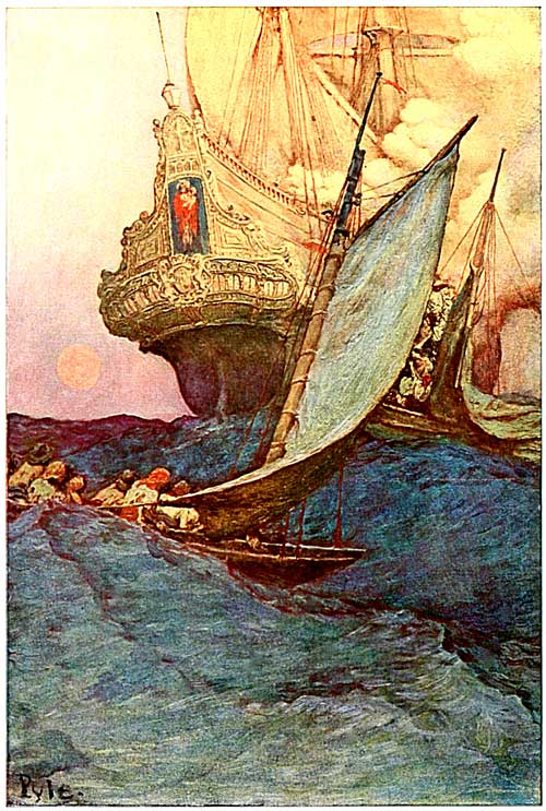
When I look at his work look mainly at the subject first. Pirates, the sea, etc. Then I noticed the strokes in the image, the use of oil paint that gives it that glossy shine. Notice the little strokes in the body of water that seem to lead to the boats sail strokes and so on. It's just something about the design on the characters, the detail the their gestures as well as other objects (i.e. boats). The oil paint captures the look and life of the pirate out on sea, with the warm sun, clouds and expansive sea. I think again, what I notice the most in his work, is the level of intensity and realism of the characters and whatever else happens to be in the work.
I like how the ocean takes up half the canvas. It makes it seem rightfully huge and threatening in a way, with the smaller boat covered in part by the wave. I also like all the different shades of blue in the ocean, it's impressive.
ReplyDeleteI really like this piece. It is very dramatic and stylized. I love the color in this artwork. It is interesting that in this piece, the warm and cool colors seem to be competing. I kinda like that. I'm not sure if that's just me. The detail on the ship is fascinating. There isn't much detail in this work, but the ship really sticks out because of that reason.
ReplyDelete