Wednesday, March 16, 2011

Yuta Onoda


An illustrator originally from Japan. Yuta Onoda is now a illustrator/painter in Ontario, Canada. His style is very animated and has a very sharp look in his pieces. I found his work to be very eye-catchy and interesting. His lines are thick and his attention to detail is magnificent. Every piece of his conveys a certain emotion and gives off a very strong vibe. I can see his pieces to be album covers of cd's or even posters of movies his work would fit in perfectly. I like how abstract his pieces are and leave you thinking of a story to go along with each one. Fantastic Artist!

"Jack Kirby's My Little Pony"


I was somewhat concerned with what I was going to post about this week. Thankfully, I just happened to come across this delightful piece of parody from Comics Alliance. In a segment of their blog called "Great Comics That Never Happened", an artist by the name of Tom Sciolli created this illustrative piece titled "Jack Kirby's My Little Pony". In my opinion, this is a really great example of stylistic parody in a visual medium. It possesses many of the staples to Kirby's style; particular use of bold lines of varied thickness and textures, characters and figures in dynamic motion, overall incredibly busy with fantastic imagery and of course, that wonderful staple of many American comic covers, Kirby dots.

Doing some looking into the artist's background, I was surprised to find that I was actually familiar with his work before. Tom Sciolli is the artist on an ongoing series of comic books called "Godland" published by Image Comics. And looking at his body of work, its rather clear to anyone that Jack Kirby is the predominant artistic inspiration for him. In fact, "Godland" shares elements of story with another of Kirby's stories in the past, mainly being the story of superbeings and their communing with extraterrestrial entities that are seemingly omniscient, as well as how the conflicts they cause affect the people of Earth. If you'd like to learn more about Sciolli's art, I would highly recommend looking for the past volumes of the comic series.

Kazu Kibuishi

Obviously, as a comic, "Copper" requires illustrations which serve the narrative well. Kibuishi shifts the perspective in every frame to jump to the most effective depiction of action, or establishment of location. The overhead view of the first frame immediately impresses the vastness of the casino, which heightens the strangeness of the situation. When Copper and his dog Fred leave the casino, two different frames establish the passage of time with their shadows.

Kibuishi has Fred comment on the absurdity of gambling at casinos, and his point is well-illustrated by the oppressive vastness of the space, which doesn't even seem to have any end. The casino is darkly lit and depicted in colors which are close in hue to each other. Meanwhile, the outside is dominated by lightness with splashes of color, which reflects upon Fred's and Copper's ability to have actual fun at the Fun Place.

Kibuishi, in contrasting a largely adult activity which seems foolish and unappealing, to a relaxing day at a park, seems to be trying to point out that kids can often be more reasonable than the adults society.

Andrew Smenos


Andrew Smenos is an artist currently based in Brooklyn, New York. This painting is one of many from his current series, that deals with stuffed animals. Some of the animals are place over paintings, and some of his work is just of them alone. The whole idea of this series is displacement, and contrast. Taking images that are different not only by concept, but overall appearance, and combining them on a single plain. To me, these paintings are a visual creation of the world we perceive, and the world we can create. With a pencil and paper, we can create beautiful, and mesmerizing images that cannot exist in reality. That's what these paintings are. The stuffed animals are there to snap us back into the real world.

Calyn Williams

I chose Calyn Williams because of her interesting style. In "doe" above there is a nice contrast between this dusty decapitated deer figurine and a bloody spider/the surrounding black spatter. Most work like this really attracts me, this especially because the cutesy of the painting does not take over. Nothing is more annoying than a cutesy anime cupcake wielding a smiling blade. This type of art is overdone. To have an actual theme of horror mixed with innocence and decay feels truly original in Calyn's work. I have seen some of this first hand at conventions and the paintings are on the smaller size which seems wildly appropriate for the subject matter. "lambykins" below.You can view her website at http://www.vignettenoir.com/


I’m not sure who did this piece, I stumbled across it online, but I think it’s really interesting. Though this piece is clearly contemporary it’s easy to see the influences of notable artists in it. The carefully rendered girl with the stylized clothing and hair, against the flat background layered with abstract patterns is strongly reminiscent of the work of Klimt. Also interesting is the fact that this work is clearly not digitally rendered, it appears to be watercolor and maybe graphite. The quality of the paint and graphite really make this piece seem alive. Though I like it overall the composition of the painting is a little strange, the way it splits nearly down the middle is not necessarily bad, but the reasons for that split aren’t really apparent so it could be off-putting to some. I’m not sure what this painting is really supposed to mean since I know nothing of its actual context, but the subjects of the painting, the moon, sleeping girl, owl, skull and rose make it seem allegorical as all of those things have symbolic meanings and have been used in countless other pieces in somewhat similar ways.

Ken Sugimori


Ken Sugimori is a Japanese artist widely known for the art and the creation the many monsters for the video game series Pocket Monsters (a.k.a Pokemon). Sugimori has been working on the series from the start, starting from 151 monsters to now 649 monsters. Most of his artwork is only Pokemon due to the fact he and Satoshi Tajiri founded the game company Game Freak.

What I like about his earlier concept and character designs is his watercolor use. I believe the shading and lighting of his art from 1996 is very different from his work now. His early work is very reminiscent of Akira Toriyama's (Dragon Ball). Sugimori's style comes off as playful and it appeals to a much younger audience. I feel that it is very successful because, due to design and creation of the game's world, it led to the Pokemon phenomenon among children. When I was younger I often found myself looking at guide books and game manuals for the series just for the artwork.


1997 Bandi Pocket Monster Card series:
http://community.livejournal.com/prtcg/8417.html
Character artwork:
http://archives.bulbagarden.net/wiki/Category:Ken_Sugimori_character_artwork

Week --Whatever, I've totally lost track

Today is a beautiful sunny day, and what better way to express my jubilation than sharing with you, my fine fellow classmates, the groovy illustrations of pop-icon Peter Max. I do not consider myself to be "into" tie-dye and the typical psychedelic schemes of 60s art, but somehow bright colors and rainbows pervade my clothing preferences and my artwork, so obviously that inspiration had to come from somewhere. I am usually more drawn to soft watercolors, washy, sketched looking pieces, realism and dreamy, beautiful people in artwork. Perhaps I'm drawn to what I don't really draw. And who knows why I draw why I do, but I have enjoyed Peter Max before and so here is a post exploring his groovyness. https://blogger.googleusercontent.com/img/b/R29vZ2xl/AVvXsEjmB5Mb4rZdzlD4T7ct7p4iLfqIJBvAsT-8crHkRmYi1ShBYhJCQocweGOblwpVj63EM_eM0eQXfHuAox9FekcqnpZGVH-L5lSwL69U8gjDjahsSC5knYviD7_EfuAgiSDjQ5NraeszG4w/s1600/05.jpg

So here is one piece.

And here, is another!

http://eartfair.com/blog/wp-content/uploads/2008/06/better_world_peter-max.jpg

What I DO love about Max is his beautiful versatility. He can approach a flat, iconic, color-by-numbers shaded illustration with equal skill as this free, thick, painterly oil color. Max obviously lover colors and is not inhibited by any artistic "status quo", instead choosing to use all of them as he sees fit. He also uses curvilinear shapes in excess, makes round things even more exaggerated and soft whenever he can. His work is very very detailed, unquestionably over the top, but all working together and toned down just enough by some black spaces (such as the big expanses of clouds in the first piece, or the big circle of the sun in the second). These areas give the viewer a break from the ever moving highly detailed energy found everywhere else in the piece, letting your eyes rest for a moment and providing some much needed balance.

Tugboat Printshop

Tugboat Print shop is a print shop based in Pittsburgh, PA. Artists are Paul Roden and Valerie Lueth that collaborate on pretty much all of their prints. Every print they produce works well but this piece “America The Beautiful” is one that stands out especially to me. It is 24” x 32” and im pretty sure it’s a 5-color print and limited edition of 200 made. The Piece works well because of the use of color, and detail involved with the carving of the wood block. They captured the landscape very well. The mountains and buildings are awesome and I love how they keep sort of a cartoony style over the whole piece. The use of the boarder is a great touch also; the banners and flags make the piece a lot more passionate about the great country. Without the boarder it would still be a great piece, but I think it brings everything together. All the little details and objects all around the images makes it ten times more awesome, and the whole technical side of creating this is even more awesome in my opinion. I think it’s a great piece even if your not a fan of American politics like me, great image either way.


Pseudo Manitou

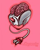
Pseudo Manitou is an artist I've followed online for a number of years. He does a bunch of different things, but the works I enjoy most of his are his subversive political posters, both illustrated and incorporating his photography.


I had sort of a long drawn out conversation with this piece the first time I saw it, because of the background I was bringing with me about the artist. He is a vegan, and a lot of his art deals with anti-consumerism themes, so what I saw first was mass marketed bad for you meat products, advertised at their tackiest level and started trying to figure out what he was saying about consumerism this time. And then the euphemism he's utilized hit me. He's taken that American consumer icon, which would appeal primarily to a mainstream American audience (though I suspect a good chunk of counter culture folks know the Oscar Meyer wiener song too) and used it to address an issue which many folks in mainstream America are none too comfortable with. Because it's not immediately obvious and in your face saying, "girls can love girls and boys can love boys", the viewer who isn't comfortable with that subject matter can't write it off at a glance, but might be drawn in by the vivid color and icons they know and then have to deal with the issue put forth. I'm also amused by, though I don't know if it's intentional, by how the front end of the wieners sort of angle up like their happy to see their partners. On that note, my only regret with this piece is that the tacos don't look happier.

Here are a few other pieces by this artist:


He also has a deviant art site which is well worth checking out.

Marek Okon

Strange and beautiful things fall out of the internet every now and again. For the life of me I couldn't remember where exactly I got this image from and it took some digging to find out the name of the artist - Marek Okon, a Polish illustrator and concept artist who worked as a freelancer for companies such as SEGA, BioWare, LucasArts, Games Workshop, CRYTEK, and many others.

This image is not a piece of concept art for a game (unfortunatelly), but rather a cover he did for a science fiction book published by Polish "Fabryka Slow". I don't read Polish, so I couldn't find out anything about the book itself, but honestly I don't really care - the picture itself tells enough of a story that I don't need any words to go with it. We may not know the fine details, but we know what kind of a world we are looking into, we know what happened to it, we can hazard a few informed guesses as to the nature of the people we see, what drives them, what their lives are like. Sure, I don't mind learning more, but I don't need to.

More of Pan Okon's excellent work can be found on his personal site (don't worry, it's in English) as well as on his Deviant Art page.

Jean Giraud: Little Nemo concept art


Jean Giraud is a French comic artist who has been involved with many movies and comics, like Tron and Silver Surfer. He also goes by the pseudonym Moebius. I found This first piece of concept art for Little Nemo: Adventures in Slumberland and was immediately drawn to it. I love the story, and I watched the movie as a child, but now I look at it as art, and I can truly appreciate it.
The environment stays true to Moebius’s fantasy/sci-fi style. It’s interesting because there is a sense of weightlessness of the figures and rocks around the portal, and yet the environment is anchored down. I’m reminded of the concept of “secondary motion,” how you must also take into account the way the characters’ hair and clothes move, and this scene poses an interesting problem because gravity is not working as usual. The contrast of warm and cool colors net to each other really makes the figures “pop” against the background. The line quality is very fine. He rarely uses a black outline, instead letting the color come all the way to the edge, and allowing the highlights and shadows to create the outlines.

Gerard DuBois


Gerard DuBois is a freelance illustrator who has had his work published in numerous magazines. Some of the magazines he has been in are The New York Times, The Wall Street Journal, Times, Rolling Stones and a handful more. DuBois also illustrated for a children's book as well. He was born in France in 1968 and he studied to be a graphic designer. He ended up finding his passion with illustration and stared doing freelance work.

I love his use of color in all his work. One of my favorite pieces he did is the Sacred Space. This is the first illustration I posted. I love the high contrast in it. It is very appealing. It is very interesting that he made the sky at night so he could add some white dots which allows the piece to tie together well with the white bottom. It is very simple but intriguing. I also love the shapes. The line work in this piece is fantastic. I love how the bottom portion looks like a cut out. The line work is so clean and perfect.

His style is quite dark and eerie. He does a lot of editorials for magazines, which helps the audience analyze his work. He seems to do some surrealistic pieces as well which are enjoyable to look at. He is a great illustrator and I love his work.

James Jean - Imogen Heap poster

I came across this while searching for something different to put in my scrapbook. I think some other people have posted art by James Jean at the beginning of the semester, but when I found this poster I thought it was really interesting to see how he handles a more commercial piece. It promotes an LA concert by British singer Imogen Heap. After checking out the Imogen Heap entry on Wikipedia and listening to some of her songs on YouTube, I can't say that I like the actual singer... however, I just love this poster. James Jean's psychedelic-nouveau style and the color scheme are a perfect fit for the light (and, IMHO, somewhat trippy) music that the poster is promoting. I really enjoy the fluidity and movement of the piece, and I really appreciate the way he integrates a pretty complex color scheme with the incredibly detailed linework - I know from experience that this isn't easy to pull off well. I think the decision to use light colors for the lines is a nice touch, as it helps maintain that light feel and prevents the piece from becoming too overwhelming.

Henry Warren week.8

This piece is called Just Ten More Minutes Mom by an artist who post on cghub.com under the surname of Contraomnes. I think this is a strange wonderful piece. I really like the weird contrast of innocence and danger. The picture was part of conceptart.org's Newborn Contest. The entry was about Newborn Imagination. Something that should resonate in most artists. Ahh splashing in the tub till the waters too cold, good times. Some of the odd things that happen and sorta work, as long as you don't think about too hard it, is the perspective and size relation of the for ground and back ground. I like the little oddities because they allow the focus to be brought to the center of the composition towards the child; especially with the triangular composition. But at the same time I am a little distracted because the variation in size and perspective ads another element in an already complex piece. The most interesting part of the composition for me, above all else, is the over lapping technique the artist employs with the imagined world and the real world. I really like the way the colors interact with each other and kind of blur the two worlds but at the same time I think my imaginary world might have a little more color to it: vibrant colors just say child's imagination but the muted colors I feel make the piece more attractive composition for a wider audience.

Chris Sanders


Chris Sanders may be instantly recognizable to those of you who have seen movies like Lilo and Stitch or How to Train your Dragon, he is the director of both and of these films and was responsible for art direction and character design for them.
His style is just that, stylish and comical, full of exaggeration and rich with detail but all the while managing to keep the lines simple and flowing. Sanders works mostly in traditional media, having been an illustrator for several years now and been educated in an era before digital proliferation, a lot of it still involves cutting paper and resizing using copies and tape.


His art is stylish and whimsical and perfectly suited for the animated industry, he opts to accentuate curvature and proportions, particularly in his female form and he tends to do a lot of fantastic creatures and animals, his images are always lively and convey an impressive amount of movement and spirit, and always manage to bring a smile to my face.


If youre interested in checking out more of his work he can be found at http://alohalilo.deviantart.com/ where he also has a couple of tutorials and images of his drafting process.

Tuesday, March 15, 2011

Yehrin Tong


I really like this piece because it really draws me in, almost as if its a puzzle and a piece of art at the same time. I think the preciseness of the patterns is amazing. Every line is impeccably placed and completely even. I love how the snakes are so tangled and spiraled at the same time. This artist does some work with typography so I suppose its no surprise that everything is so precise. Designing typography requires incredible attention to detail and very precise measurements so it seems logical that this artist would cross over into both facets of design. This artist does some album designing too and I feel like that kind of work would influence a piece like this. Album art is geared both to be interesting to look at and also to see music so its important that the art draws the viewer in and intrigues them. I feel like that is exactly what this piece does. Additionally, I think the black and white was a good route to take with this piece. The lines and patterns are so intricate that the absence of color allows for an element of simplicity in a piece that is not simple at all.

Winnie Truong


"Bride of Dede"

Winnie Truong is an artist from Canada. Her works are large-scale compositions of colored pencil and pastel crayons on paper. Truong's style is meant to question the nature of hair, skin, and beauty as a whole. It is also a comment on portraiture. In the work, "Bride of Dede," the skin and hair are handled with the same long, exact, strokes with multitudes of underlying colors. The small bubble-like cysts almost cover the body in beautifully lain groups, and treated in the same way that "beautiful" objects like beads, berries, or grapes might be. I believe this is a comment on the illusion of beauty and our perception of "imperfection." Using what would be a horrific skin disorder, Truong weaves together a portrait using the beautiful and the grotesque, until a work is created in which we have trouble telling the two apart.

Her Website:

http://www.winnietruong.com/

Tom Preston


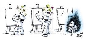
Tom Preston is a traditional art illustrator. Even though it is a comic, it has no lines between the panels and no borders. This piece is cool because only the creative ideas and emotions are colored and everything else is black and white. I also like the use of hatching and cross-hatching for the shadows. Tom likes to draw things and emotions that he has experiences and try to make it repeatable to others. In this piece he takes the idea of an artists' creative ideas that he wants to put on a canvas from his head. The ideas are bright colors and cute fun things. However, it doesn't come out the way he wants it and becomes depressed. That is why he is crouched down at the end and a depressing blue gloom is over him.

Ryan Mauskopf


The artist I chose for this week is another I stumbled upon using google images. I did some research and browsed his site and his online portfolio. His name is Ryan Mauskopf and he is an illustrator, graphic designer, and musician from New York City. His favorite gallery of mine is his illustration section. What first caught my eye is the diversity of his portfolio. He has several different styles that are each very strong. But as I looked closer, I discovered one thing all of his pieces had in common (well except the b&w ones), excellent execution of color and shading, in particular his mastery of reflective light/color. In the piece “Why Wizards Shouldn’t Cook” (the first image) Ryan uses reflective color of the smoke against the wizard. His reflective color gives excellent luminosity to his images and provides fantastic depth. Take note, that as the color of the smoke changes, the reflected light it cast on the wizard changes too. Although Ryan doesn’t list where these images have been used, my assumption would be for online articles or magazines. His “Gaga Bo Peep” and “Cronus and the Delicious Baby” are satirical images towards pop society and the upper class. I very well see these accompanying articles in today’s media. Last but not least, “Medusa and the Optometrist” is another fine example that his work is often humorous. I’ve given his website at the bottom; it’s really worth checking out!

http://www.ryanmauskopf.com/

Rodolforever


Rodolforever (couldn't find his real name) creates this amazing art deco style of different movie posters/characters in his art piece. I'm a crazy fan, in terms of simplicity, in any art work. To my left shows exactly that. What really caught my eye of this piece is its simplistic gesture of the form of superman. It seems like the artist really dissected superman's figure to its simplest form to the last limit of recognition. The other point i like to add to its clarity is that you can quickly grasp the figures identity, not including the help of superman's iconic logo. The color palate he used in the illustration gives this light and elegant feel to it to give the sense superman is flying far far away, i thought it was a great choice of color that kind of compliment the superman's color clothes. The text he used enhances that deco style feel to the whole piece.

Floyd O.L.J. Butler here. Today we are looking at Batman #577 penciled by Scott Mc Daniel. It is illustrated in a western cartoon style. the period it takes place in is the present sewers or swamps. The technique is comic book style with outlined in black lines that outline the character and his foe. This is for a comic book audience, meant to grab a buyers eye with Batman crouching over while the alligator lurks behind him. Scott Mc Daniel was commissioned by DC Comics to do this art piece This was the cover for May 2000 of Batman, was meant to bring a consumer in to buy the comic. I think it is a very successful piece, with Batman in dangerous waters with an alligator lurking behind him, it really jumps off the page. Makes me want to read it just to see if Batman gets out alive. It also looks kind of sinister, like Batman seems to not know the alligator is there. If you like Scott Mc Daniel art work check out Nightwing and Batman back issues.

Minni Havas: Michelle Obama Fashion


First lady Michelle Obama’s fashion has made headlines around the world. She’s known for taking risks - with color, accessories, and lesser known designers. Her interesting choice of clothing has given her a signature style and earned comparisons to Jackie O. as the chicest First Lady in the White House since the Kennedy's. During the campaign trail for the preliminaries, Michelle Obama repeatedly won over the fashion critics with her fresh take on what a future First Lady should wear. Minni Havas is an illustrator represented by Pekka Agency. She is from Helsinki, Finland and she works with colored pencils and masking inks. This image of the First Lady clearly shows her passion for fashion, given the pose she's in, and was a way for Minni Havas to further emphasize Michelle's fashion sense to the public. Michelle is seen here as a powerful figure, not only in the political world, but in the fashion world as well. Prior to Michelle Obama, First Lady's were seen wearing dress suits and drab color schemes. She has definitely brought a new take on the First Lady and Minni Havas has done a good job in portraying that. Michelle Obama is fresh, modern and clean.

Monday, March 14, 2011

Week 7: Untitled


I found this one while browsing an art folder and it immediately caught my eye. I'm not sure, but I believe the artist's name is Shinkiro. I do know that this piece was done for the videogame company Capcom (most likely for "Resident Evil") and the artist is one of the guys who worked on "King of Fighters". If you look at Shinkiro's work, his style is the closest that resembles this piece. There are several things that make me love this illustration. First of all, I was drawn to the photographic quality of it. It almost looks like it was a real picture that was edited in Photoshop to look like an illustration. Secondly, the imagery is fantastic. at first I noticed a pretty woman with a gun to her head. I was forced to go back and look hard to see why she was about to shoot herself and I noticed that she's surrounded by a horde of zombies. It's interesting that the color guides your eye though out the image which I think tells the narrative the way the artist meant it to be told. The expression on the woman's face really drives the point home. Her blank stare says that she's tried everything and she's giving up.

Cornelia Hesse-Honegger's Insects


Cornelia Hesse-Honegger is a 20th century scientific illustrator from Switzerland. She is best known by her illustrations of bugs affected by radioactive residue left behind in Chernobyl. This series got her an article in the UK’s version of ‘Wired’ Magazine. The attention to radioactivity’s affect on insects, plants and animals in fallout zones has also made her a leading force within the art activism community.


Her work is highly detailed and more colorful than most scientific illustrations. Although she often uses watercolors to achieve muted colors that best mimic the actual color of the insect that is being portrayed. She also often has an array of insect shells on grid paper to compare the various ways a particular species has been mutated.


She also decides to, as an artist; crop out the heads of the specimens as often as possible. This is most likely an attempt to take the gross factor out of the insect, so people can look past it and see the mutations. Often in her work the mutations are hard to see, because this is how the insect really appears and she makes no attempts to embellish the mutations.


She has quite a few toxic places on her website.

Touko Laaksonen aka Tom of Finland


WARNING! If you look further than this post you will see sexually explicated illustrations. For four decades Touko Laaksonen, a Finnish artist notable for his stylized fetish illustrations of gay men, become the twentieth century’s most influential producer of gay pornographic images. He created over 3.500 illustrations. His style in the late 50’s early 60’s partly influenced by the U.S. censorship codes that restricted the depiction of “overt” homosexual acts. His work was published in the beefcake genre that began in the 30’s. By the end of the 60’s the beefcake market collapsed, but his work changed attitudes about male frontal nudity in magazines and movies. His most prominent work was a comic series called Kake, which included the archetypes of lumberjacks, policemen, sailors, bikers and leather men. Just think of the popular late 70’s music group “The Village People.”

Mary GrandPre

This is the first cover illustration for the Harry Potter series which was done by Mary GrandPre. She has done not just all the Harry Potter covers and chapter illustrations, but other children picture books such as Chin Yu Min and The Ginger Cat, Pockets and several others. I felt that this piece was successful because when trying to grab a younger audience bright colors are very helpful. Also when Mary made this cover (and all of the other Harry Potter covers) she selected images that were used in the book to help show in one collaged image what the story would be about. What I found interesting about this was that every image she chose did not do anything to reveal any secrets about the story. So giving nothing away Mary was able to communicate what Harry Potter was about in an interesting and eye catching way for not only children but even adults.

Week 7 Blog Post


Gustav Klimt was an Austrian painter, and a part of the Vienna Secession movement. He made paintings and murals, and lived from 1862-1918. He mostly painted women. This is Mäda Primavesi, an oil on canvas painting he made in 1912. The painting is of Mada Primavesi when she was nine years old. It was made as a gift for André and Clara Mertens, in memory of her mother, Jenny Pulitzer Steiner.

I found this painting interesting because most of the portraits I see are of people with a sort of blank expression; as if they were so bored they just wanted to leave. But if you look at this girl’s eyebrows she seems more determined, ever so slightly. This is backed up by her pose, with one arm bent to her hip, and her legs spread out. It’s almost like she’s saying “what are you looking at?” Instead of being passive as many portraits are.

The background looks to be an assortment of textures and colors like most of Klimt’s paintings. I like how the green and pink in the background matches the flowers on the girl’s dress, and I think the artist did well separating the matching tone of the background and the girl’s dress and legs so that you can tell they’re separate. Also, the texture on the dress is rather interesting. I like how the dress has three different textures in it, and they make it look like fabric would.

I think it’s a very good portrait: I usually find portraits boring, but I really like her expression and stance, and the background is well designed. The green in the background seems to frame the white floor in a way that leads your eye to the girl, and the pink wall in the background contrasts nicely with the green floor.

Saturday, March 12, 2011

"Blondie" Chic Young


I was looking through my lecture notes and I came across "Blondie." I pretty much forgot what the strip looked liked or even contained, but I was really happy when I actually looked further into the strip. "Blondie" created by Chic Young is cartoonist that knows how to bring about good story and great drawing skills. What draws me the most to Blondie is the design to one of the main characters "Dagwood." This guy is hilarious, and I just love how he has those big eyes, and crazy looking hair. I could spot him out in a crowd, if need be. Also, the main Blondie, is a very cool, strong minded character. For me he captures that attitude in Blondie in the character he designed and that really makes a drawing more than just an awesome drawing.

Whats more about Blondie, is that it catered (and mostly likely still does) to the middle class, I guess what one could call "every day people" with its illustration of life day-by-day. I was reading a little bit about Blondie on the Internet and found that it came out during the depression and it highlighted themes of love, family, etc;Things people could relate to. A great example is this strip here. Very funny, great layout and drawing ability and does a great illustrating the thought process of certain men. Below is another strip(one strip repeats, could not get off)