Wednesday, September 29, 2010

XSV


Last weekend, I was flipping through my DVD collection, and I came across “Heroes for a Day: the XZV story”. The movie is a documentary that fellows a professional paintball on their struggle to prove themselves to the world of paintball. The illustrations I picked for this week at from a booklet that came with the DVD. The booklet is filled with a bunch of stuff that was collected throughout the duration of filming the movie. They do not list credits these illustrations. Since all the other stuff found in the booklet is from the team, my guess is either the filmmaker, Patrick Spohrer, or one of the team members made the drawings.

I picked these illustrations because they were always my favorite pieces from the booklet. Yeah, all the pictures are cool, but the drawings show me more personality. Instead of picking up a camera and pressing a button, someone actually picked up a pen or pencil and drew it out. I enjoy the style that the drawings are done in, too. The world of paintball is not a clean one. It is rough and dirty at best. These drawing fit that. They look to be sketches that could have been right on the sidelines while watching a match is being played. I would have not liked them as much if they looked like someone had spent many hours in a studio trying to capture every detail.

I’m wondering if anyone else feels the same way as I do about photo vs. illustration. Can a photograph completely replace an illustration, or are there things that a photograph will never be able to show that a drawing shows?

doze green


So this week i managed to find a lot of interesting clippings from magazines which i thought qualified as great illustration. Unfortunately I left my book at home so i cant scan them for this week, but they will be up next week nonetheless! Anyways i took this as a great opportunity to show a piece from one of my favorite street artists among the many i have. His name is Doze Green, and he works out of Bay Area California. He has made a huge contribution and spin of street art in general. His work normally incorporates a lot of mythological creatures dealing with themes such as life after death and human virtues. His style, technically, relies heavily on fluid line and almost cubist compositions of vibrant colors and effects. This piece in specific is made from ink and acrylics. Whats it's about i'm not too sure, i do know its visually stunning to see it in person, i don't think this picture does it any justice. Im not sure of the dimensions, but when i saw it it took over half the wall up in height, its probably somewhere around 6 or 7 feet high, which i think is part of what captures and makes its presence dominant in a gallery or wherever the setting. Most ,Doze Green's, work is in large scale format since he was originally a muralist, tagging the streets of his native town in New York. I love this guys aesthetic , im absolutely into this futuristic character styles he plays with, so i figured i would share the wealth.

_yael

Itadakimasu!


Japanese for “Let’s eat.”

(I’m currently combating a migraine and a narrowly avoided artist double-post, so this should be fun.)

Shingo Shimizu is based in Toronto. After graduating from Ontario College of Art and Design’s Communication and Design program, he moonlighted as a DJ in clubs and lounges before being commissioned by club promoters to create flyer and poster designs. His work earned the attention of art directors, and eventually he progressed to full-time illustration, as well as character and graphic design. He still DJs nights at local clubs and has said that music is a major driving force in his art. Some of his clientele have included Scion Canada Lifestyle Magazine, Coca-Cola, Virgin Mobile, Puma, and Toyota.

Shimizu’s work has a very appealing comic book feel that is inspired by pop art and manga. His figures are dynamic, and he does a good job of using color to influence direction. There is also a decent balance of saturated and unsaturated areas to prevent viewers from being overwhelmed.

In the above example, the line weights are varied and delicate, giving the overall image a carefree feel that seems appropriate considering the girl eating in just a bikini. Her expression is inviting, which fits with the text and gives the illustration a pin-up sort of sex appeal. His choice of cool, muted tones throughout the majority of the composition is calming, but then the splashes of melon on the blush, lips, and chopsticks add a hint of excitement as well as movement. I always appreciate pragmatic design, so seeing illustrations on stationary and dishes is a multifaceted treat. In this case, the "cheeky" invitation to eat also serves as a rather effective advertisement for whatever might be on the plate, a sort of double entendre as it were. Either way, to me this design is very successful in appealing to multiple senses. I might even be more inclined to eat on this than compartmentalized zoo animal plates. (Oh, the heresy!)

Shimizu’s blog has snippets of his latest projects, new music, and other cool inspirational things. (My favorite part was the Scion Canada Lifestyle Magazine back cover originally having a Mountie on it… that had to be changed to a lumberjack because it wasn’t approved. Plan B ftw!) Check it out! http://www.shingo.ca/blog/

http://www.shingo.ca/

Parra


I'm apparently beginning a theme for myself of choosing Dutch illustrators with bizarre styles, vibrant colors, and sexual tones. Last week I talked about Zeloot, this week's entry is another artist I enjoy from the Netherlands known as Parra. I believe my first introduction to Parra was through Juxtapoz magazine, though shortly thereafter I noticed a boom in his exposure when I started finding his work for Vans in my local skate shop.

His style, like that of Zeloot, is one that is heavily reliant on strong, vibrant color schemes, usually of only a few colors and almost always on a black background. His drawing style is perhaps more crude that the aforementioned Zeloot, though it is in this crude and playful nature that Parra thrives. His work is often a reflection of his upbringing in Amsterdam's red light district, evident in the seedy nature of some of his pieces. Much of his work contains whimsical characters, with beak-like facial features and beady little eyes. These features, along with the bright colors, make Parra very inviting to viewers.

Then you have the type. Much of his work contains hand drawn type, and it is obvious that he takes his typography just as seriously as his illustration, as his text is often times just as fun to look at.

Combine that with his bizarre, humorous, and sometimes sexual messages, and we're left with a very satisfying illustrator. You can see more of his work a read about Parra here.

The hunt for NERO

This week's blog post is a little different from my last two posts. I did some major digging on the internet and had no luck in finding more information about an illustration I found. On my way to the 623 Wabash building I noticed a pretty interesting graffiti sticker. It was on the parking lot sign on the corner of Wabash and Harrison. The sticker is roughly 8”x10” in size and contains two cartoon like illustrations. The size of the sticker is the first caught my eye, but as I examined the work more closely I began to like it more. The two dinosaur/squid like characters have a really nice bold line work. The piece showed a lot of weathering and all the colors are faded. I believe the artist's alias is NERO, which is used in speech bubbles. So I tried to find out more about NERO using Google and came to a dead end. That didn’t stop me there I went on a hunt looking for more of his work. From The couple blocks between the LaSalle Street station and 623 Wabash I found eight more sticker illustrations (on street/pay to parks signs) from NERO. These eight new findings were quite smaller (3”x5”) than the original sticker. The character that NERO draws with marker stays constant in every sticker, but the colors and where the alias is written changes. I will continue to try and found out more about NERO and keep an eye out for more of his/hers work. If anyone else finds more stickers or knows more about the artist leave a comment.

(sorry about my bad quality camera phone pictures)

Assorted Things and Stuff

The images of the archer and the nude holding a sphere are culled from a printed library of old copyright-free book illustrations. These are interesting because of how they have been pulled out of their original context. The images of the archer seem to have been for some sort of instructional booklet. I placed them on this page because they seemed to work well with the image of the criminal and also mimick the pose of the dancer and nude figure.

The top image is copied from a Push Pin Graphic anthology of early magazine content. This cover was from an issue which revolved around the concept of Crime. The cover/ interior combo was interesting due to the simplicity of the second image in sequence to the first image. The first is colored with bold reds and oranges and guns and knives frame the face of the smoking man. The second has several bullet holes piercing the still smoking silohet of the man. It seems to reference shooting range targets and is a great illustration of such criminal action.
The dancer was pulled from an illustration anthology featuring many different artists showcasing their best work. This stark black and white image is a wood cut illustration, though it is unclear if it was a commission or a personal work.
See more of her work here.

Looking at her portfolio of work at the above link, I am struck by something other than the work, which influences my perception of the work. It is not showcased in the most interesting manner, nor is there any other available information on each piece. I find when browsing a creative professional's webpage I want to know more about how each piece came to be. If I were looking to hire someone I want to know who they've worked with in the past, and how much experience they have had with other clients. This would give me a better idea of what to expect from working with them. With my website I want to present as much information as possible to promote my work, experience, and anything else with might influence a client to hire me.

Big Fan of the Simple


I do truly love this piece and this illustrator. Natalie Kilany is a contemporary illustrator who uses traditional media such as watercolor and pencil to create simplified and fantastical imagery usually geared towards children. This particular image is one of my favorites. It is entitled Puppy in the City and though I am far older then the intended audience i can still find this image pleasing to the eye and effective. I believe this is a true show of talent. The ageless and timeless quality of her work make her appealing to a wide variety of viewers and truly raises her above many other artists who may be more technically skilled. She uses a wide variety of colors mostly in the pastel pallet and she tends to use rich vibrant colors to contrast the softer pastels. I hope everyone enjoys this piece as much as I do.

grrr


So so so, another blog about how some other artist is a shit ton better than I am.
I somehow managed to pull myself away from final fantasy 14 long enough to actually acknowledge life outside of this mmo and DO SOME WORK so lets get down to it.

For my blog post I'm doing an concept artist of a younger age (ugh at younger people better than me) who goes by the title of Grey Sapphire. i have a great deal of respect for female artist who are better than me.. as much as i think i suck for my age i can highly respect (and hate) anybody better than me at a younger age... its also kind of hot.
Her illustrations are ridiculously well done, humorous and i like them a lot.

my biggest problem was deciding which one to show because they were all so quirky and awesome so i made a collage of like 5 or 6. I’m blanking on things to say because i am one level away from a level 20 armorer <_<.>

so look at the pictures while... I go do that.

skadoodles!


Good Ideas?


I came across this video in the past week. I found it to be pretty interesting. Both from the standpoint of the ideas put forth in Steven Johnson's new book, but more so from the hybrid use of illustration and animation to create a video for the book. It involves a white board drawing that progresses in a sped up sequence to sync with the Steven Johnson's speaking. For the most part they are a series of still images in sequence, but as the video progresses there are a few hints of animation used to accentuate certain points being made by the speaker. At the end of the video the shot pans out to reveal that all of the drawings have been designed into a light bulb, which mirrors the design of the text on the book cover.

I found a few things very interesting. The hand of the artist is prevalent in these drawings and in the video in that you witness the drawings as they are being drawn. The other thing I found interesting is that no one was credited for producing the work. After some digging, I discovered the video had been created by Cognitive Media, a UK design firm; however there are no individual artists credits.

I really think that even though there are some elements of animation for embellishment, this stands as an illustration because the story is being told visually through related still images in sequence, kind of like how comic books work as you are reading them. They are also purposefully composed into the shape, and when the video is finished, you are left with a single cohesive drawing. It is a video that also happens to be an illustration.

Cognitive Media: http://www.cognitivemedia.co.uk/

- Joe Koch

HUSH


I personally like when graffiti writers use spray paint to create murals, portraits or things other than just words. not to say that i don't like graff writters traditional style of individualized style of text as image its just allways nice to see some thing different. Especially when it comes to having the opportunity to make a respectable living off what one loves to do. Also to note Hush is not a graff writter, he "is just an artist of many talents." I like this piece because of the use of color and theme. most of his work is aimed at the way women are depicted in society as well as bringing attention to status. thats why in his work you may see a higher ranked woman of royalty illustrated in a very rough almost random style of graff techniques. in his style you can tell that things are not so much premeditated as they are created in/of the moment.

You Should Try The Toilet Paper


A few days ago my roommates sent me to pick up some toilet paper, so I decided to make a trip to Trader Joe’s since I had to grab some other groceries as well. Typically, I don’t purchase toilet paper from Trader Joe’s because I’ve always been scared that such a product from the environmentally friendly store would be made from some rough natural tree bark or something...but I decided to go for it this time because it was only 3 dollars and some odd cents for 12 rolls, which seemed to be a good deal, and it had some pretty eye catching packaging. The fashion of the illustration on the toilet paper wrapper is actually quite similar to my last post about The Little Traveler bag. On the front is a group of some fine ladies and gentlemen dressed up in 20th century style clothing for a dinner party. I stood in the aisle giggling at the captions. The guy in the center says, “If you thought the brisket was good, you should try the toilet paper.” Not included in this post is an illustration of a ship they put on the side of the package that says, “Did someone remember to bring the toilet paper?” How in the world is this related to bath tissue? Whatever, I guess it’s not, but it worked on me with my absurd sense of humor. So I was sold. Shitty toilet paper (lol) or not, my roommates would just have to deal with it.


The illustration reminds me of someecards: decorative, lots of detail, line drawings with some cross hatching, vintage-y and historical, 20th century, and very minimal color palate (this one being brown with a few pastels). I honestly could not find the artist, but in my research I did find someone who does similar work. His name is Matt Weems, and he serves as a new source of inspiration for me in line art. Here’s some of his work.


I’ve also posted some parts I cut out from the paper bag I received with my purchase of toilet paper. They have all kinds of pretty things on the bag, such as line drawings of a spoon, tea pot, and carrot(?). I think that’s what it is. I enjoyed the illustration of the two characters having a picnic with a quote bubble saying, “Is framing the bag and hanging it on the wall reusing or recycling?” Trader Joe’s commemorates art, which I believe helps with their sales (along with the friendly staff, reasonable prices, and promotion of recycling). Art is everywhere in the store, from packaging to chalk drawings on signs, which makes the environment more inviting and alluring. They actually have a sign artist position, which I might check out.


Sophie Blackall- Missed Connections


Sophie Blackall is a Brooklyn based illustrator who creates work for children’s book and various magazines. Her illustrations typically feature cartoon-like human subjects set in whimsical and sometimes abstract scenarios. Her color palette is soft and watercolor seems to be her choice of medium. While most of her work is for a client to explain a story, place, feeling, or behavior, the work I found that I most enjoyed was her work found in her Etsy shop.
The work that Blackall decides to sell all depict a Missed Connection post found on Craigslist. The missed connection section contains words of anonymous people of a certain city, reaching out to strangers they felt they had a spark with, in hopes that they we receive a response. Blackall re-imagines these words into pictures which contain the original words from the anonymous poster. It seems as though that sometimes she picks the most unusual and sometimes romantic posts she can find in order to create an interesting image.
I enjoy checking her blog every now and then to see the new missed connections that she's illustrated. Oftentimes she illustrates a very literal image from the missed connection, instantly turning the maybe slightly serious words of the Craigslist poster and turning it into something more playful and humorous.
I find this concept so completely charming and clever and so very mad that I didn't think of it before! On the other hand, however, there are so many posts on Missed Connections daily and so many ways to interpret them. I believe that it'd be good practice to challenge myself as an illustrator to come up with clever images based off posts that I find intriguing for my personal enjoyment and growth.

Here is her blog for those who would like to follow! --> http://missedconnectionsny.blogspot.com/

Johnny Wander


To say I like web comics is an understatement. As a matter of complete fact, the majority of the bookmarks on my tool bar are web comics. I've even had to shorten them to initials just to get as many as I can to fit. I check them daily, even though they have set update days. JW, or Johnny Wander, is one of my absolute favourites. Even though it only updates Tuesdays and Thursdays, I check and reread it every day.

Johnny Wander is a biopic web comic illustrated bu Yuko Ota and written by Ananth Panagariya (Who also does the writing for Apple Geeks). It picks odd moments out of their lives as they live in an apartment with long time friends who also work in the industry of art, comics, web design, and video games, with some fictional stories mixed in as well. Johnny Wander has been in action a little over a year now, and has already inspired other comics, fan art, and a song.

Yuko's illustrations are one of my sources of admiration. She has an excellent command of line and tone. Her cartoon style is reminiscent of Brian Lee O'Malley and Jeff Smith, and her colour works command the force of Mucha. She has an incredible knack for portraying story through image, making Johnny Wander a charming and lovely (Not to mention comical) addition to any bookmark toolbar.

Prismacolor

My entry for this week comes from my 24 set of prismacolor colored pencils. The pamphlet talks about the product as well as the 6 featured artists for the set series. I tried to look up who was the artist for the image above in particular but couldn't find their name online. I do know that they give you the name of the artist of the on the cover of the set you purchase. What I lik about the illustration above was the overall color and how it contrasts against the dark outline. Out of all six covers, I've always been a fan of the 72 set cover because of the thick dark lines and the Mucha inspired format it has. I find it interesting that all the covers have their subjects looking in the same direction.
While looking for the names of the artists, I ventured on the website and discovered that a Columbia faculty and previous fundamental drawing teachers was a featured artist of the site. I thought that was pretty interesting. A few other artists featured on the site graduated from schools in Chicago.
To take a look at some of the other featured artists on the site, as well as prismacolor products go here: Prismacolor.com

ESPN


Here is one more entry that I really wanted to from the ESPN website. I know I have done an example from the website before and this will be the last one I post for our blog entries from this particular site. I just wanted to talk alittle about this new trend that is taking over the ESPN website. To me, it seems as if they hire the same designer each time they decide to do an illustration because to me, it seems like it is the same style all around.
As I have looked through several of these illustrations (there are more they do than the ones I post), It has really grown on me and started to make me think of some options I have after graduation. I always wanted to do something involved with sports and graphic design and never really thought of going this route. I guess illustration really can be used for anything. I always figured I would try to get a job over at ESPN or Comcast and do some of their campaigns for each Chicago sport but this is something to really consider looking into. Just some food for thought.
I am really curious as to see if they will do this every week throughout the course of the season and wish there was some way for me to find out the feedback from the audience who views these illustrations on the website. Does it work? Does it make people want to read the article? Is it a refreshing new way to look at article photos? Just some things to think about

Tomer Hanuka

This is an illustration by Tomer Hanuka for Wired magazine’s October Issue. Hanuka illustrates for magazines like , Rolling Stone, The New Yorker, Spin, Maxim, and the list goes on. This specific illustration is for a section of the magazine dedicated to the apocalypse, featuring a skull, on some sort of spear amidst the ruins of a city. I love the colors that are used, as well as the way he depicts shadow. The line weight and color creates awesome atmospheric perspective, and directs your eye to the main focus of the picture.

Wired is definitely one of my favorite magazines. I assumed it’d be all about computers, and boring tech stuff that I don’t really care about, and while there is a little bit of that, there’s also information about things I never really given thought before, but ends up being totally interesting, like how things are made and work. They have an entire section of the magazine dedicated to the apocalypse, everything from who’d start it, to how it’d go down, and how to survive, and articles about how we much energy we could generate from the ocean’s waves, if we knew how to harness it, and how roller coasters are designed. Not to mention it’s filled with illustrations. I’d say they use illustration just as much as photography, which isn’t something I've come across often.

http://www.thanuka.com/

http://www.wired.com/

Kraken


Not to come across as a complete alcoholic, but when trying to "discover" illustration around me this week, I was shocked by looking at the liquor bottles atop my fridge and noticed how many are "illustrated" designs.

This was one of my favorites that I found. The drawing/design of the Kraken is masterfully drawn. There is a lot of depth used through line weight, gradient, and technique. The type chosen creates a balance to the illustration. In the text chosen at least three different fonts are used, which play greatly off the different weights of the lines in the drawing of the Kraken.

The company that makes Kraken Spiced Rum, really stays true to the label design in the rest of their merchandise; including their website, glasses, t-shirts, etc. They also have a "history" of what a Kraken is and how it relates to their product. The company really has found a niche market and great illustration/design that sets them apart from the rest.

Maybe, I'm just a sucker for "retro" designs or I could just be defending one of my favorite rums. However, I think that the illustration invokes exactly what the seller was hoping to.

Tuesday, September 28, 2010

Junk Rethunk


Well, I would have entered this sooner but spent the past 2 hours or so trying to figure out why my scanner hated me, it works now. (had to scan this in because I couldn’t find a full copy of the same image online) I found this image while actually “looking” through a dwell magazine that I got a few weeks ago for a different class, I didn’t notice this picture then cause I was skimming for other things then. This drawing was done by a artist named Steven Harrington. At first glance of this picture, I didn’t think much of it, thinking it was just a randomly put together doodle. But really looking at it, I saw more to this that it just made my mind dance with the flow of it and its color. The little details I think I liked the most, because lately I’ve been really into drawing patterns and the little shapes and dots really appealed to me. I started to appreciate this drawing and his work all together after looking him up to see his other work. I just like the little quirks in his work, how some of the objects have faces, and at the bottom of this image is a sketched out road with little stick figures to really show the intended scale of this piece. Each time I look at this picture I see a little more to it and it just really makes me want to know what goes on in his mind to make what he does. And I think this was titled “Junk Rethunk”.

Klaus Voormann


Klaus Voorman is a German born Illustrator who is known best for his artwork on the cover of the Beatles album Revolver. He is also a musician who became the bass player of the band Manfred Mann during the 1960s. After 1969 he became a studio bassist working on several solo projects. He played bass on just about every one of John Lennon's solo albums. He played with George Harrison, Ringo Starr, Eric Clapton, Harry Nilsson, Lou Reed, and many others as well. He met the Beatles in Hamburg during the late 50's early 60's. The top picture is a portrait he made of John drunk on a rainy night stumbling through Hamburg. He has all his Beatles Hamburg illustrations on his website.
Revolver has always been my favorite album, for its music and illustration. The illustration reflects the changes the beatles were going through. I like that it is in black and white, a large percentage of his work is black and white. I like the simple lines that construct the faces. The meticulous detail in the hair is very impressive. I like how it flows and tangles through the collage of photos and illustrations in between.

check out his website, he has a lot of impressive stuff---voormann.com

Mr. Noir and Miss Grigio


These illustrations are done by Harry Slaghekke at MASH Design Agency and are made for the Marauding Vitners’ 2-buck chuck line of wines. I came across this label when I was researching wine labels for a side project this week. I think what drew me to it was how abnormal it was for wine packaging to have realistic drawings (or paintings) of people on them. Also, it is done in grayscale, and has a plain white background. No earthy (AKA cliché) elements are shown besides the suitcases filled with grapes. They look like they are done with India ink and originally on watercolor paper. I love that they are in black and white because it is indicative of the Film Noir style and the figures definitely fit that time frame as well.
I definitely think this is a successful package design because it is witty. Who would think to put two and two together concerning the double entendre with the word “noir” in pinot noir? It seems like such an obvious solution but I probably would have never thought of it. The designers then took it to the next step and created these characters, Mr. Noir and his female counterpart Miss Grigio, and they look like they fit perfectly with the wine. The white wine is the woman, which makes sense because it is lighter and more elegant (in my mind). Mr. Noir is for the red wine and works because the character looks beefy and manly. These characters would definitely drink the wine that they are representing. I don’t know. I just like it.

Travis Millard


The work above is that of the artist Travis Millard. Millard is a reputable illustrator known for his intricate (often humorous) pen and ink drawings on paper as well as his commercial work. I discovered his work three or four years ago from a series of skateboard graphics he did and instantly fell in love with his work. His work is usually done with ink washes and pen, and is usually done on a pretty small scale. Millard’s work has a somewhat loose feeling to it, due to his technique with ink washes and watercolor, but at the same time tightens up his drawings with his line work and detail surrounding the ink washes.

Millard’s work can be seen both hanging in a frame on a gallery wall and commercially as well. Some of Travis’s commercial work includes companies such as Burton snowboards, Foundation skateboards, along with dozens of album covers and book illustrations. Along with his commercial work, he has also started his own publishing company called Fudge Factory Comics, which prints small books and various zines.

What I truly appreciate and enjoy about his work is that its all hand made, even the commercial work is hand drawn with pen and ink. In a world that heavily relies on computers and technology, especially in advertising and advertising art, Millard still makes phenomenal pieces of work that’ll sell a product without the use of modern design techniques. I’m a person who would much rather sit and draw for endless hours to finish an illustration rather than sit at a computer and create and image on Photoshop or Illustrator. There’s a connection and a process one makes with a hand made drawing that can’t be replicated with or by using a computer, and that’s what I truly appreciate and can relate to his work. Along with his process and style of work, I also thoroughly enjoy the imagery of his work. Most of the imagery is usually pretty playful and humorous, with a hint of sarcasm and disgust at times. When I go through his online portfolio from drawing to drawing, I find myself laughing to myself quite a bit. I enjoy when art can make this happen. A simple drawing that can make someone happy is always a good thing and something I try to practice in my work as well.

You can check out his work at http://www.fudgefactorycomics.com/

(Also, checkout his girlfriend Mel Kadel’s work. She’s also an illustrator with an awesome style and body of work.)

Yak Pak

About the tag:
This tag is from a Yak Pak brand purse that I bought (Yak Pak makes all sorts of handbags and backpacks). I like the illustrated style of the tag. It's fun, pink and metallic. I also like the tactile function of the tag—it’s printed on thick cardboard, and is a good size to hold in your hand (this is probably the reason I saved it). The tag is pretty appropriate for the brand, because many of the prints on their bags have a similar illustrated style. They have changed the traditional image of a yak—a large, brown, hairy thing—to this silly, fun yak (with a pierced horn and peace sign necklace), and it fits the style of the brand.


About the bags:
Yak Pak is one of my favorite brands for handbags because they have such fun illustrated prints. They always have new strange prints for purses, such as pills, hedgehogs, and venus fly traps. They generally stick to a simple color scheme for each bag and print. Everything seems to have a hand-drawn feeling, and this fits well on the soft fabric the bags are made out of. One of my favorite prints is the venus fly trap and butterfly bag. It may appear as a floral print from far away, but looking closely you can see it's a venus fly trap. I also like the hedgehog and mushroom print bag. Overall, the style of their illustrations is cute, girly and works well on the bags they make.

Wednesday, September 22, 2010

How to be an Action Hero


The illustrations I picked are from a book called, “The Action Hero's Handbook”. The book is filled with dozens of skills that action heroes use in TV shows and movies. Each page of illustrations show how-to visuals with a short description below. The three skills are how to tell if someone is lying, how to dust for fingerprints, and how to catch a great white shark. Like many instructional illustrations, these images can be confusing with the context, but once the context is known, the images explain themselves.

For the, “How to dust for fingerprints,” page, the illustrator broke it down into four simple steps. The panels are made up of grinding pencil lead into fine powder, sprinkle powder onto surface, lightly dust surface to reveal print, and finally, use tape to transfer print. In the “how to tell if someone is lying”, the illustrator again, created four separate panels. The four scenes show the women shifting uncomfortably, looking away, scratching, and sweating.

Both pages are fellow the rule of giving a lot with a little. The illustrator uses line drawings instead of photographs. A photograph would overwhelm the reader with unless details, but the line drawings give just the right about of information. For example, the panel that shows the women sweating is made up of a nose, lips and little beads of sweat. There are no personal details that are unique to each face. To show movement, the illustrator simply used little lines around the moving part to simulate motion.

When I first read this book many years ago, I thought the drawing and diagrams were cooler to look at compared to just reading about it, but I look at the book again and my view changes completely. The visual and the reading make a great mixture that teaches the skills very well.

-Danny

Hark! A Vagrant


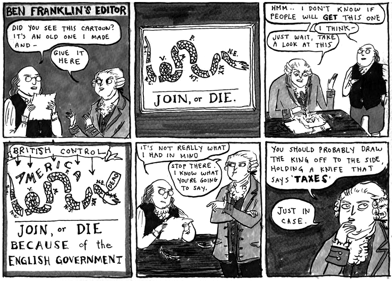
Kate Beaton has a degree in history and anthropology. She worked for a while with the University but decided to try drawing full time. She draws little, often three panels or less, comics which mostly feature historical figures in absurd situations, mixed with assorted cultural and literary references. She is also Canadian, and often takes time to make fun of her nationality and her heritage. Her quirky humor often elicits awkwardly loud laughter in quiet coffee shops.

The short comic above is an excellent example of her style. In this case she uses the simplicity of the early American cartoons to skewer modern political cartoons. Often quickly drawn with rough gestures remaining in the final versions, her figures have surprisingly vibrant and expressive facial features. Even when the figure is barely a scribble, the emotion of whatever moment is illustrated perfectly with a few dashes and smudges.

Visit her full website at http://www.harkavagrant.com/

week 2


So this week, as I was starting my duties to scavenge any illustration or drawn material, I came across an interesting flyer right downstairs of the Wabash building. Among all the other kitschy garbage flyers with useless information downstairs, I came across this guy. It is most likely for some bullshit event, that will prove to lack in any fun, but nonetheless it is a very interesting and dynamic illustration, chosen to promote the event. This flyer stood out from the rest because most flyers and cards you see downstairs are very graphic design oriented with a lot of digital imagery, and more commonly, the incorporation of photographs, or images manipulated in that manner. Not only is this illustration pretty visually stimulating, but it carries an older aesthetic of classic american illustration, such as Norman Rockwell and Don Crowley. It contains a very comic like realness to the characters, which isn't used to often anymore. I also can appreciate the contemporary feel to the drawing with the juxtaposition of the classic style. If you study the image, it is pretty comical and contemporary in the fact thats it's fun and humorous, in a simple since, instead of the deep irony and dark humor which older illustration use to rely on more. It's a pretty fun image, and is a great example of incorporating the old with the new. Who the artist is, remains unknown since there isn't any information in the corner or on the back on who did it. It makes me wonder the copyright issues of the image and the integrity of the artist. This sort of stuff gets to me because the copyright issues should at least incorporate where the image came from and protect the artist who did it. Anyways i'm sure this was just grabbed off the internet from whoever made the flyer, and jsut decided to slap the text of the event on there. Regardless, take a look and enjoy, the guy floating in space seems like he's probably having to much fun.

-Yael

Tomey Tunks Flyer

The illustration I’ve picked this week is a scan of a flyer that I came across at a small exhibition opening from this past summer. It was a small show in Columbia faculty member Anna Koon’s garage that she turned into a small gallery space to hang work. The work varied from sculptures to instillations to paintings all crammed in a tiny space, but all in all they all worked well together and weren’t too overpowering. In the back corner I saw a painting on canvas that looked similar to this particular illustration and I spent a good amount of time gazing at the overwhelming amount of detail. The artist is a student named Tomey Tunks. I personally have not met him, but I enjoy his work and can relate to his process, style and amount of time he takes to make a piece of work. I also spend hours upon hours filling in a pen drawing or paint on a canvas with immense amounts of small detail that may get easily looked passed by the viewer, but I know it’s there, and in my mind it has to be there, no matter how long it takes to create.

On a table below his painting in the exhibition was a stack of his flyers amongst stacks of business cards from other artists. When I looked at the table my eye was immediately drawn to his flyer. All they where were black and white photo copies roughly 5”X7” on computer paper, but they were a hundred times more appealing then any other card or piece of information on the table. There were three or four different images to choose from in a stack, giving the viewer a choice of designs to choose from. Not only do I enjoy this particular artists work and appreciate the process and time spent to create it, I like how he got the attendees from the show interacted with his work, even if it’s in the slightest way. Everyone who attended the show could take a small, inexpensive piece of his work and be reminded of his work and imagery, more so than from taking a plain white business card from a stack with a name and an e-mail on it. Over all I loved and appreciated his work and the idea of giving out small pieces of work to anyone who attended the exhibition.

damn you alex.

This weeks entry was done on a non official rival of mine by the name of Alex P.
Alex is an up and coming German concept artist with a bizarre imagination and and insanely powerful level 50 technical wield. I say hes my rival because despite how good i am and how much ive practiced in life he still dominates me as a anatomical monster.
I am not 100% sure how he got so good to only be 20 (im 23) but he achieved a level of anatomical precision some people drawing in their 40’s and 50’s don’t have yet; mixed with his strange poses and camera angles and you've got one hell of a conceptual artist.

Besides the art ive shown he has a weird sexual sense of humor, drawing massively destructive robots with innocent facial expression and huge (taped on effect) penises, for example.

The pieces i choose if they can be called pieces are from a wide range of sourced from his imagination to his take on famous characters from batman and superman all the way to throw backs like the thunder cats.

I both hate and greatly respect him, if we met id like to punch him in the face and then buy him lunch

superfishal

This week I’m writing about an artist I found doing the scrap/sketch book pages. While looking in my skateboard magazines I saw an ad with just an illustration and the words “superfishal” and on the bottom superfishal.com. So I did some digging and found out the artist who created the work is Jeremy Fish. So I Google his name and located his personal website sillypinkbunnies.com. I found out that he does work for a clothing company I know and admire Upper Playground, which surprised me.

Fish’s drawing and line style is very unique. He makes bold designs with animals and skeletons. The thing I really found cool about Jeremy Fish is that he does a lot of mixed media paintings on wood blocks. He explores between making pieces that deal with modern and past times. Anything from the gold rush era in the 40’s to the 90’s Internet issues using animal in place of humans to get his message across. Fish’s work on word blocks show really interesting brush stokes and bold graphic outlines that makes he style unmistakable. After researching about him and looking at his work Jeremy Fish is now on my long list of artists I like. For more info about him and his work check out his website www.sillypinkbunnies.com

heres a time lapse of Fish working.

OH, ROOTIE!


Gale's root beer is delicious. Really delicious. I can't even begin to express just how mindbogglingly delicious it is.

The first time I saw this illustration was a few years ago when I had ordered a Root Beer at Lula Cafe on Kedzie in Logan Square. The illustration was the absolute first thing that I noticed about the entire product. Before I even began enjoying the root beer, I inspected the drawing.

It is a really fun and playful illustration. There are friendly lines and bright watercolors to really bring the nature of the work home. The figures and linework really reminded me of some of my favorite early 20th century illustrators like Winsor McCay and E.H. Shepard. There is an adorable childhood innocence all over the Gale's Root Beer piece that I've always loved from the other two aforementioned illustrators.

You may know E.H. Shepard as the "Winnie the Pooh" guy. But, there is actually a separate A.A. Milne publication called "When We Were Very, Very Young" that was also illustrated by Shepard. The work is a collection of poems about childhood. Here is an example:


The lines are almost identical in style. If I was unaware, I would believe that it was the same illustrator behind both works. Obviously, though, if the Gale's illustrator was intent on creating a sense of childlike innocence, they chose the correct influence.

The other illustrator that I mentioned is also pretty similar. His style is a bit different but it promotes the same overall mood. He is really one of my favorite artists ever. This is the work of Winsor McCay:

He created the "Little Nemo" character as well as the "Little Nemo in Slumberland" series, which are some of my personal favorites.

That's about it.