

Friday, May 4, 2012

Thursday, May 3, 2012


Monday, April 30, 2012
Final 2nd rough

Friday, April 27, 2012
Worst Day comp


But given the chance. I'd do it all over, not exactly the same, but close to it and with more flair.
Final project Best Day Ever

Thursday, April 26, 2012

Friday, April 20, 2012
Worst Experience Ever.

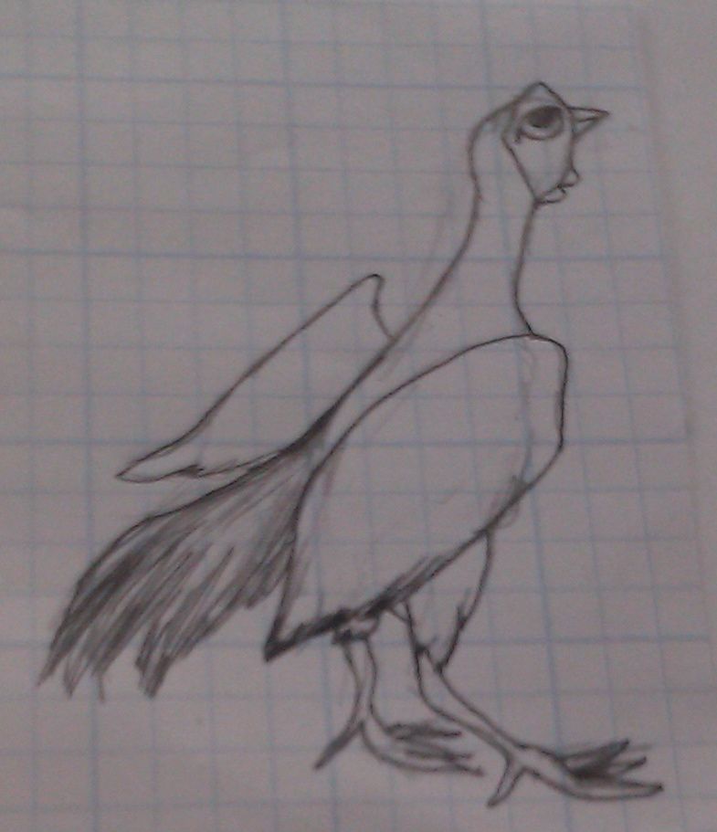
Final Project- Best Day Ever (concept sketch)

As for the drawing I plan on the setting of Wrigely becoming more prominent. I want it to look like an actual world series official photograph. The composition need work and the fans in the background that are represented currently by squiggly lines will be tightened up because I think their expression will be just as important - if not more so- for the piece. I am not sure what medium, probably colored pencils our watercolors but we'll see what happens and where the drawing goes.

Thursday, April 19, 2012

Friday, April 13, 2012


Thursday, April 12, 2012

Wednesday, April 11, 2012

Friday, April 6, 2012

Thursday, April 5, 2012
Week 10 Final Sketch

Friday, March 30, 2012
Week 9- Updated sketches


Hey guys,
Thanks to your suggestions I went these two ways with my concept. The top one is of the rooster looking up at the sky while all the other chickens are pecking at their food.
The other way I went is of a young chicken looking up at the birds flying in the sky copying them only to learn that is a grounded bird.
In both images I exaggerated the size of their feet so it subtly makes them appear more weighted to the ground. I animated the faces slightly by cartooning the eyes, more so in the young chick.
Which one do you guys like better?
I plan on doing full color and I think I would like to do a realistic background. The medium will probably be water color base layered with color pencils and then finishing details in acrylic. Any suggestions or thoughts would be great to hear!
Friday, March 23, 2012
The remix

I played with the "stand", moving it around a bit. I think its new position improves the readability. Although I am aware the "stand" kinda looks like "spand", the final will be much better.
Thursday, March 22, 2012
Updated Sketch

For medium I am still not sure what I want to work with. However, I have in mind of working with color pencils because it can bring a lot of texture and I don't really work with color pencils so it might be interesting to try it out with this project.
week 8 Unrequited puppy love

I always considered myself more of a dog person than a cat person. I actually feel more compassionate to a dog than to human being. I think this is because you can always count on a dog to give you unconditional love. Even if you have a bad day, you can always count on your dog to make you feel like you're worth something. I actually got this idea for a drawing at the dog beach. There I witnessed a man on a his cell phone completely ignoring this adorable puppy at his feet. The small dog looked up at the man towering over it with this happy expression on its face, while the man on the phone seemed too preoccupied to even care about the dog. I found this scene pretty heart breaking and decided to illustrate it. I decided to give my illustration a faux-naive feel to it to give it a feeling of innocence. I also plan on using charcoal and crayon on my final piece.
Friday, March 16, 2012
Unrequited love

Here is my interpretation of unrequited love. This work was inspired by a hardship I was going through. The message is pretty simple. I started the situation with great confidence and was optimistic, but I was definitely burned and heartbroken in the end.
Week 8- Project 2

A legal controversy

Thursday, March 15, 2012
Unrequited love

My idea for the drawing.

week 7 Controversy

In early June, 2007, Swedish Artist Lars Vilks was invited to an exhibition called "The Dog in Art". Vilks submitted three pen and ink drawings of the Islamic prophet Muhammad is a "roundabout dog". According to Vilks, the intention of the drawings was to "examine the political correctness within the boundaries of the art community." The day before the exhibitions opening, Vilks's drawings were denied due to the fear of violence from Islamic extremists. After the first denial, Vilks's drawings were refused again by the Gerlesborg School of Fine Art. This stirred up an intense debate within the Swedish media. People began to question the values of self-censorship and freedom of expression. It wasn't until August that his drawings were finally published. Soon after, about 60 Muslims began to protest out side of the building responsible for the publishing. Within a few weeks this number skyrocketed to over 500. The Muslim community viewed these drawings as blasphemy towards Islam's most worshiped symbol. After the publication some of the employees who worked for the newspaper's headquarters required bodyguards to simply enter the building. And as for Lars Vilks, he received death threats on a daily basis. Half way through September, the Islamic State of Iraq announced that they would give $100,000 to anyone who brought them the head of Lars Vilks, and $50,000 for the head of Ulf Johansson, who was the editor and chief of one of the newspapers. Vilks's bounty was raised to $150,000 on the order that he would be "slaughtered like a lamb". To this day, Vilks's is still under constant attack from threatening mail to hackers infiltrating his blog. I personally always thought that it was a good thing to spark any emotion in someone with my art. Even if my artwork pisses someone off, I still view that as an accomplishment, Not in Vilks's case though. I think he knew what he was getting himself into, thus he deserves the repercussions.
Friday, March 9, 2012

If you haven't guessed, or are unfamiliar with the piece this is modeled off of German Artist
Not that i disagree, but i took a different approach to my piece, one that would better express the complex, irrational notion of young love. The emaciation and elongation of the bodies also helps to express the emotional turmoil of the subjects. Just like when Eve initially stole that forbidden, they two lost their innocence.

Saddam Shark

This installation was made in 2005, by the artist David Cerny. This became one of many controversial installations that was banned in Middelkerke,Belguim, then in Bielsko-Biala, Poland. The main purpose of this installation was a parody of another work done by Damien Hirst named,"The Physical Impossibility of Death in the Mind of Someone Living" which was created in 1991. The purpose of the installation lets you relive that moment in freeze time. It lets the audience contemplate what it would be like to be in their shoes, or in short words -dead. It also gives a message that anything can happen in matter of seconds. At one point everything seems to be fine and then out of the blue a hold breaks.
I think this is a really interesting piece. I do admit that it is offensive, especially because of the location that it was going to be placed. I think in the end it was the right thing to show-case it in a museum and not
outside where children could be expose to it and be shocked by it.
Controversial Body works

This work is done by German anotomist Gunther von Hagen. Displayed at "Body Worlds show" http://www.guardian.co.uk/education/2002/mar/19/arts.highereducation its intention is to familiarize the viewer with the inner-beauty of the human body.
Von Hagens style started 25 years ago when using polymer chemistry, pioneered a preservation technique that replaces water in cells with plastic material. By 1990, he had plastinated his first whole body - a process that requires 1,500 hours' work and costs up to £25,000. The result is an odourless, dry, realistic-looking corpse that endures. Gunther asserts,"There are obviously aesthetic elements to what I am doing, but I am chiefly a scientist who wants to enlighten people by means of aesthetic shock rather than cruelty shock."
His many critics compare him to Dr. Frankenstein claimming his work is cruel, insensitive, and self serviing.
Not really seeing for myself a problem with Gunther's work, I admire his presentation. Carefully arranging internal organs, ribcages and the such takes talent in addition to a strong stomach. Why is human anatomy or organs shocking and disgusting in the first place?
Thursday, March 8, 2012
Week 7- Conflict

This is an editorial cartoon by artist Gary Markstein. Directly below the image is a link to one of his websites that has a collection of several of his cartoons including a lot of his recent work. I looked at some of his other stuff and he has some other really funny ones that relate to this one, depicting Rush Limbaugh. This kind of perfectly depicts the one of the many contemporary conflicts occurring in women's rights. The conflict of natural right versus religion, should the law of man control the rights of an individual. His is consitutional if religion is forcing its prohibition? I liked this cartoon because it elegantly uses iconic symbols and manipulates them to effectively get the point across.
Friday, March 2, 2012
Life and Death- A Juxtaposition

In this image we see one lonely man walking through a "hall" of large statues of hooded skull figures. The corridor seems to go on endlessly. There are flocks of birds flying away from what are presumably their nests in the crevices of the statues. It follows a monotonous color scheme using foggy, putrid yellows contrasted with a small amount of green in the shadows.
Although not obviously about life and death; in this work they are not polarized. However, the juxtaposition of the two is very apparent. The foggy hallway is completely barren of other people. The lone figure appears to be either lost or exploring a relic of ancient peoples. Skulls peak out through the hoods of the giant statues, a clear indicator of death. They almost look down at the man, awaiting his collapse. The juxtaposition is specifically that of the lone man walking with a torch, and the statues as a reminder of a civilization past. A lone man alive in a dead world.
Zdzislaw Beksinski: unnamed piece done in oil
link to his online gallery here: http://www.beksinski.pl/ click on "Original Works"Life & Death: Ontology

This piece is made by the artist David Titterington. It's 54cm x 74cm and it is charcoal on paper. I think this is an interesting piece because the whole shape of the figure is some kind of flower blooming and as it blooms a child is being born. Below it, we can see a skull which represents death. I think the name itself gives it an interesting thought, I think this quote better sums up what the meaning of Ontology means, "An explicit formal specification of how torepresent the objects, concepts and other entities that are assumed to exist in some area of interest and the relationships that hold among them."
Life and Death

Thursday, March 1, 2012
Week 6 LIFE & DEATH

The illustration above was created by Richard Warren in 2007 as part of a series called Seven Suicides and was exhibited at St Peter's Church Wolverhampton. The drawing depicts the early 20th century artist John Minton and famous actor James Dean. Minton's life story was a tragic one. In the mid-1950s, Minton found himself out of sympathy with the art trends that were becoming fashionable. Not being an abstract artist, he felt "sidelined". Minton was also seen as an outcast but other artists for his homosexual lifestyle. He also suffered psychological problems, abused alcohol, and in 1957 committed suicide. Towards the end of his life, Minton became obsessed with James Dean and his untimely death in 1955. Minton was fascinated by Dean's devastating car crash and it inspired several of his later work. I believe this is why Warren depicted Dean and Minton together. Minton almost appears to resemble Jesus on the crucifix as Dean gently consuls him. Some believe that John Minton was a martyr for the homosexual community and Warren's illustration strengthens this argument. Warren's style within the composition mimics but does not copy the style of Minton and is a good tribute to the artist's work.

M.C. Escher The Eye 1945
This piece has always interested me, this is where my fascination with eyes began. But it's much more than that. I cant say for certain, no one can really, unless they knew the artist personally and his intentions when creating the piece. But to me, the eye represents life, more than that still. the eye is round, one could argue that it is the circle of life. All is one. One is all.
And what of the faintly outlined skull creeping in the pupil. Escher was considered an illusion artist, the skull sits comfortably behind the eyes, always out of view. The skull in Western society also repents death, mortality. Maybe Escher is teasing us with the one who watches over all of us, the fate of each of us, death. There is no great expanse of life for us all, just the small time we have, constantly being watched by death just drawing nearer to our destinies.
Week 6- Life and Death

Friday, February 24, 2012
The symbol of the Eye of Horus

Picture here is an image of The Egyptian symbol of the Eye of Horus. It represents good health, political power, and safety. It was worn as an amulet by those in power (Pharohs and royalty). Interestingly it was used as a measuring device because of its proportion, which are also symbolic in nature. The eye can be split into 6 distinct pieces, pictured here:

These pieces represent the 6 senses (one more than we are accustomed with.
1. Touch 2. Taste 3. Sound 4. Sight 5. Smell 6. Thought
In egyptian culture it also represented the sun while the Eye of Ra represnted the Moon.
The Symbolic Kiss

This image depicts US President Obama and his rival Venezuela's President Chavez. The word "unhate" at the top of this image along with gentlemen's head connected by the lips, clearly suggest acting out the metaphor "kiss and make up!" (thats what I get) But, according to US customs, two men kissing is definately associated with homosexuality. To some, homosexuality is considered a weakness within men, especially ones in position of power. So could this be an attack on either President's prowess, or manhood in general? HMMMMM!
Thursday, February 23, 2012
Sheltered Weaklings

Week 5 SYMBOLISM!!!

The Garden of Earthly Delights is a painting by Hieronymus Bosch from around 1505. To me, Bosch seemed to be really ahead of his time because this triptych contains some of the most surreal symbolism in High Renaissance art. The piece shows three panels, each representing a state of one’s immortal soul. The first panel on the left depicts the beginning of life. Some believe that the left panel represents the Garden of Eden, and the original sin that came with it. You can see the animals in the background fighting, almost as if it is foreshadowing the doom to come. The middle panel shows a wide array of nude people indulging in several sinful acts. This panel also has a huge cluster of symbolism. Whether the figures are practicing sexual performances or partaking in other sinful acts, it is clear that this panel is trying to portray the fall of man to evil wickedness. The last panel in the triptych is Bosch’s interpretation of hell. Some art historians believe that Bosch hid the 7 deadly sins within this panel in a symbolic manner. In this section, animals are depicted torturing and mutilating humans, which might represent the natural evil that is in our world. One could honestly go on all day reading into the symbolism in this painting. It’s almost like a Where’s Waldo in the sense that every time you look at it, you notice something new.
Politics

Here we have a poster that features a man with rope through his eyes, neck, and ears. During the time this poster was made Germany was in the grip of both a massive Depression and the uprising of the Nazis Party. This poster symbolized the politics strengthening control over media, especially relating to politics.
If you want to know about this click the link or watch the film Freedom On The Fence, which is where i got this one from. But it's worth the time i ganrauntee it.
Subscribe to:
Posts (Atom)