
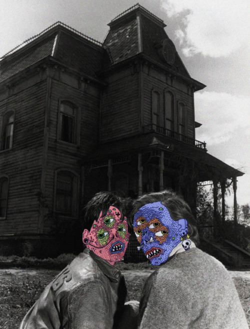
The only name I have for this artist is their Tumblr name which is:
http://thedarlingandthedirty.tumblr.com/, on there they have more artwork. I chose this particular image because of the style it is drawn in. With my drawings I often like to use more of an organic line style and varying line weights. Though this is not the only reason I chose this artist, I was drawn to this work (all of the artists work really) because of the grotesqueness of the drawing. In the last few weeks I have tried to draw some of my own works with this same style, the open mouths with uneven teeth and skin with age lines covering it. The piercings covering their faces are also something I add into many of the faces I do in my own drawings, there are just many comparisons that I can make to my own work but at the same time I don't think I am any where near as close to gold as this artist is. In the end I just think the tiny little details in the lines are what really make the piece great, a lot of times there can be too much going on or too little but there is just enough here.
When I first saw this I thought it was shocking, but in a good way. The contrast of the photo and the illustrated bright colored faces is disturbing. I like she didn't rely too much on the grotesqueness of the faces. It's just enough to pack a punch.
ReplyDeleteI think that this is a really cool piece! It's sorta creepy but kinda funny as well. The black and white photo gives it a dark and mysterious look, but when you see the drawn on faces it brightens up the image. There's also a lot of texture in their faces which works. You can really tell that they are monsters because of the details in the eyes, skin and mouth.
ReplyDeleteI love this. I've been seeing a trend recently with people drawing over photographs in a very flat, cartoony style. Especially black and white photographs. I personally thing it looks really good, especially if you want to grab someone's attention. As strange as it sounds.. I like it because the concept is so out of place and awkward that it seems to belong and work well with the image.
ReplyDeleteI like the blending of a real photograph with drawn on zombie heads of the two people. I think this really says a lot about contemporary art, and all art reflects the spirit of the times. It's a realistic photograph that's possibly old or from a movie mixed in with a digital drawing. It mixes media, digital with an old black and white photograph. It also mixes in with the current zombie fad.
ReplyDeleteWhen I was scrolling through these and saw the top of the house I surely did not expect to see the faces of the people. I love it though, I think the house fits perfectly with the faces, and the fact that it's mostly black and white is a great contrast for the faces to stand out even more. It kind of reminds me of like the hills have eyes for some reason.
ReplyDelete