Thursday, March 10, 2011

In The Court of The Crimson King


The epic progressive rock relic "In the Court of the Crimson King" by: King Crimson is undoubtedly a one of a kind in several ways. Aside from the music being incredibly groundbreaking the design proves to be quite unique as well. The cover art was designed by Barry Godber, a computer programmer. The most unbelievable aspect is that this is the only painting he ever did according to my research and very eerily he died of a heart attack shortly after the albums release. The original painting was rescued by the guitarist of King Crimson Robert Fripp because it was left sitting in direct light in the offices it was stored in. Not bad for a one shot deal. One detail that may go unnoticed is that in the inside spread if you cover the figures smile you can see the eminent sadness in his eyes which as Fripp said "What can one add? it simply reflects the music".

Crimson Irony


For my last blog post, I wanted something that was really controversial and had a strong opinion backing it up.  I recently found this piece, called "Crimson Irony", on deviantART by a user named yuumei.  Yuumei’s style is usually along the more anime-ish genre, but this piece obviously has a more serious tone behind it.

I’m not the biggest fan of sharks.  This is probably due to the fact that my parents let me watch the movie Jaws when I was about 4 or 5 years old.  Now every time I see a scene in a movie, TV show or commercial that involves an underwater scene I pretty much freak out and expect to see a great white lunging out of the darkness towards the screen. 

Despite all of my fear for sharks, I am also extremely fascinated by and interested in them.  I watch a lot of Shark Week programs and I was vaguely aware of the problem of finning, but I didn’t know much about it besides the fact that it was a very cruel act towards sharks.

Yuumei shows this problem in a very stark manner: the shark in her picture has been finned and is slowly spinning towards the bottom of the frame, blood staining the water around it.  At first that’s all I saw, and when I read what she had in her description of the piece, I was appalled.  I kept coming back to the piece because it had such a strong impact on me, and the second or third time I viewed it I noticed the faint hands that were reaching up from the bottom of the frame towards the shark.  The hands make the piece even more chilling than it already is.

While we may see commercials for the ASPCA (often with Sarah McLachlan singing in the background) and see poor, abused (but cute) animals, we never see commercials advocating awareness of the danger sharks are in.  Sharks are not cute and cuddly like puppies and kittens, but they are just as worthy of our help as other animals are, and Yuumei’s piece unmistakably gets that point across.

Wednesday, March 9, 2011

Takato Yamamoto


Takato Yamamoto is a Japanese Illustrator most known in Japan for his dark imagery with pieces revolving around life and death. I first heard of this artist from my favorite band, Dir en grey, due to the fact that he illustrated the cover art for their single “Dozing Green.” Yamamoto has such a unique style heavily influenced by old ukiyo-e, woodblock prints.

What I love about the work is his sense of imagery. Many of his pieces contain people with a souless, emotionless stare either committing a horrible act or just being in a fixated position with plants, incests, or many various objects “growing” on them. Within this piece, it shows just that. I chose this particular picture because of the extreme attention to detail it has; from the picture’s visual texture, it is as if you can mentally feel it.

deth p. sun.


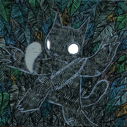
I first encountered Deth P. Sun's work while living in San Francisco in a smaller gallery attached to a pop-culture-y themed shop. For some reason, I was immediately drawn to his pieces. Most of his work is either painted or inked.

Sun manages to create landscapes that are both detailed and extremely barren. This may be due to his use of contrast in color and well as leaving most of the texture in his work to the settings he places his characters in. Some pieces are even set in space... literally... as in, black backdrop with stars represented by white dots.

His character design is simple, but it often seems like his characters are engaged in some sort of epic adventure with foreign creatures and swords. Swords and lanterns are commonly shown throughout his work. His main character seems to be a black cat of sorts (most often, at least). The cat is often encountering wolves and ghosts. Everything he does feels so basic and almost childlike, but still seems to be part of some larger theme or plot, making his work feel consistent and parts of a larger whole. Perusing his paintings feels like viewing flashes of one epic story, or pieces of smaller stories circling the same cast of characters.

His most recent pieces include a broader use of color and texture, but still retain his classic bold black line-work and flatter use of color. Even with additions to his color palette, however, the work manages to not stray too far from his older work as to alienate itself, as he still sticks to pieces that mostly feel cooler in nature, only using small bursts of warmer colors here and there.


brian lee o'malley.


Brian Lee O'Malley is a Canadian comic book artist, most well know for his Scott Pilgrim series. I think what really works for him is that he has a very simple style that is still very recognizable. O'Malley's line work is able to look both slightly messy, mostly by varying in weight, yet it still translates in a way that is somehow neat and easy to read. He's able to stylize his characters to a slightly a more basic human form, but each character is completely distinguishable from the other and manages to retain an appearance and personality of its own.

When working in color, O'Malley often favors loud, attention grabbing colors. The work he creates in color most often has a bright and poppy feel to it. His coloring methods are often simpler as well, as he tends to stick to flat coloring and occasionally uses techniques that
resemble cut-outs when the line work is taken away.

The style that O'Malley has come to work in translates very well to his comic work, both in black and white as well as in color. Every character is still highly readable on a smaller scale. Even though the pages he creates sometimes have a lot to look at, he's able to keep his scenes from becoming overwhelming through smart use of selective shading and clean-cut line work.

Michael Sieben


Michael Sieben is an illustrator based in Austin, Texas. Most of his work is influenced by skateboarding. His stuff can be seen all around the world on products, in prints, and his writings for Thrasher Magazine. Most of his illustrations are flat, with a few selected colors. I really like this look, I think it works the best in print. Most of his drawings and paintings are of animal figures or creatures. They usually look like simple portraits. I think the style is sort of retro, but at the same time I think it also looks comic book-like with the think black edges. Some of his designs are used for skateboards, skateboarding shoes and other products. I think this is awesome that illustrators can cross realms into other markets with their designs.

http://www.msieben.com/

In trying to pick an illustration to write about I was thinking about the fact that we now need to talk about the context of the pieces we find, the piece I ended up wanting to work with was this one, by Henry Darger. Henry Darger is particularly interesting in terms of context because he was so very reclusive, his work seemed to be for himself alone, rather than a particular audience, and he lacked a real background in art. Dargers work, though it may look a little dated because of the use of stylized magazine elements from his time, has an overall timeless and otherworldly feel to it. His lack of formal training In the arts led to a style that seems unconstrained by formal conventions, his compositions are often crowded, the colors are wild and the forms fantastic. His style, which is distinctive but not necessarily deliberate, is even perhaps ahead of its time, whether because of the influence of Darger or by chance there is a great deal of work done now that seems to echo his.