Tuesday, March 1, 2011

Sean Chao


I don't know what exactly Sean Chao intended in this painting, but I think he wanted to depict a child's daydream. Here he expresses a very distinctive and playful point-of-view, and I'm not just saying that because of the subject matter of a giant polar bear destroying a city. The sky is a wild collection of active, golden-hued brushstrokes, while the buildings evoke flavors of ice cream more than they do typical colors of a cityscape. One smokestack emits grey squiggles while a building in flames emits simple, overlapped transparent strokes of grey.

My favorite aspect of this piece is the people. Dwarfed, flattened and abstracted, they're here only to serve as props in the scene and victims/witnesses to the chaos and destruction. Some of them are falling off the buildings, and most of them are screaming. Chao's use of blank word bubbles really adds so much, as it indicates a whole lot screaming, and it lets gives panic and chaos a very concrete presence. And of course, this use of comic book vocabulary reinforces the piece's connection with childish whimsy.

Nihei Tsutomu

Nihei Tsutomu (or in European order Tsutomu Nihei) is a Japanese comic book artist. This image is the cover for the second volume of best known work - a (now finished) series called "Blame!" - little known and really hard to get in America, but wildly popular in his native Japan and in Europe.

As the internet puts it, "Blame! is what happens when an architect and M.C. Escher fanboy decides to draw manga", and yes, Nihei-san often seems to pay more attention to the details of the environment than the characters, but that works really, REALLY well for the comic and that one image in particular. It communicates perfectly the loneliness and marginalization of the human figure and gives the audience the sense that this world exists in permanent stasis, devoid of motion, change, and therefore - life.

Additional note: while this cover is colored (conservatively) the pages of the comic itself are all done in black and white. Frequently un-shaded black and white. And there is a lot more black than there is white.

Yes, the world of Blame! is not a happy place. And yes, I do find it visually stunning.

Don Hertzfeldt


I first heard of Don Hertzfeldt my first year at Columbia in History of Animation. "Billy's Balloon" was the the very first thing the teacher showed before kicking of the semester. There's nothing like starting a new semester with a Hertzfeldt cartoon. I've loved his work ever since. I even got to meet Hertzfeldt a few years ago at the Musicbox Theater. He's a really nice guy. For those who don't know, Don Hertzfeldt is an animator of short cartoons. His early works usually have a message and are always full of dark humor. "Billy's Balloon" is supposedly about domestic child abuse. His later works are a bit longer and the messages are a bit more grim and clear, but Hertzfeldt still tries to keep a sense of humor.

What fascinates me most about Hertzfeldt's animations is his simple style. His characters are made up of simple lines and shapes with "stick figure" limbs and giant eyeballs. Most of his films are against a plain white background. Despite the simplicity, his illustrations are very refined. Many fans have tried to duplicate his style, but not many can achieve that clean look. It's easy to spot the real Hertzfeldt toons. Check out his website, Bitter Films, and his DVD "The Animation Show" which he put together with Mike Judge. It features many other cool animators.

Henry Vandyke Carter is a much-overlooked illustrator that has contributed much to the worlds of medicine and illustration. He was active from 1853 to 1888. The later years were consumed by his work on Gray’s Anatomy. Interestingly enough H.V. Carter was not even an Illustrator by trade. He was a reasonably skilled surgeon. And upon completion of his illustrations and his retirement he was honored with the title of “Honorary Surgeon to the Queen”. To many he is the grandfather of Medical Illustration; perhaps only da Vinci has the potential to take this title away from Carter.

H.V. Carter had a unique drawing technique often using simple techniques to show parts of the body. In Plate 50. (Base of Skull) he happens to use lines to denote shading and depth. However, notice how he uses only vertical and diagonal lines to achieve this. He does this so that when he draws the horizontal lines to identify areas the lines are crisp and distinguishable. This allows his line work to be modestly complicated yet not be overpowered by the denotation of physical aspects.

James Christensen

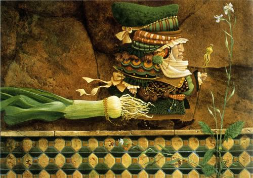
Man Taking a Leek on a Wall... for a Walk - By James Christensen


I came across a book about James Christensen in the library when I was doing research for another assignment, it just leapt out at me while walking past the shelf. The colors of the illustrations on the cover really grabbed my eye, and the whimsical proportional distortions and ridiculous accoutrements of the characters, forced me to go over and take a look. The costumes of most of his characters speak to colonial era dress and older time periods, but to a large extent feel like the sort of patchwork doll clothes you might see at a small town middle America craft show. He distorts the noses and the jaw lines to create an exaggerated trust forward of the lower half of a lot of his faces. The piece that I was most amused by is called "Man Taking a Leek on a Tiled Wall for a Walk." In it he has exaggerated the hight of the face, making the nose once again the most prominent feature. The body structure of the figure like many of his other illustrations is either really fat an bulbous, or really thin underneath some seriously bulky clothing. In the image, the leek the man is walking, floats beside him on the ledge, like fish seem to in many of his other images. His work is very whimsical. In the book, the designer has paired many of his painted illustrations with similar black and white line work, and in some instances has overlapped the two making them seem like part of the same image. It's a fun juxtaposition, which seems like it almost could work as a style itself. I'll be checking it back in soon, so if anyone wants to take a look, the call number is: 759.13 c554j


Dr. Seuss ( Theodor Seuss Geisel ) is/was and American writer and cartoonist best known for his children’s books. He has also written under the name Theo LeSieg and in one case Rosetta Stone. He published 44 children’s books, some of which have been made into movies. Most people don’t know that he worked as an illustrator for several advertising campaigns, and as a political cartoonist for a New York City Newspaper called the PM were he drew over 400 political cartoons, mostly supporting President Roosevelt’s handling of the war. While in the U.S. Army he worked on an animated film named “Design for Death” which won an Academy award in 1947. Also, Gerald McBoing-Boing, which was based on one of his original stories won an Academy Award for Animated Short Film in 1950. His birthday, February 29th or March 1st, has been adopted as the National Read Across America Day.

I think Dr. Seuss is not only one of the greatest Children’s book authors and illustrators. I don’t think he’s given much credit today even though his books are part of most if not all children’s every reading life.

Iain Macarthur


Iain Macarthur is an artist that I stumbled upon over the weekend. I have been looking at his work in more detail and I have to admit, it has grabbed a strong hold of me. A lot of his artwork has an ethnic/tribal flair to them which is very interesting for it calls for major detail throughout his pieces. Many of them are intricate and draw you in and throughout the image to really understand what it is you’re looking at. This image in specific is under his surrealist work. His use of interwoven patterns over this woman’s face is very unique. It somewhat flattens her face, however, the idea that this pattern is going in front and behind her really pops her forward so we don’t lose her face. I enjoy the several white spaces he’s left throughout; it allows the eye to rest for a little before returning to such an intense image. His shading is subtle yet adds enough dimension to the figure's face. He also said that he strives for photorealism. Although I don’t think he has achieved that in this piece, his other pieces support that statement.