
Thursday, October 14, 2010
Don't Forget! Lev Manovich Lecture: Oct 20, 6:30 pm
Wednesday, October 13, 2010
Chicago Artist: POSE.


 So sticking with my last blog post this week’s is also on another local street artist, Pose. Pose is a world famous Chicago street artist. He started out just doing spray can graffiti. Later he gained a spray can sponsorship, which shot him and his work into the spot light. Now he does work for various companies like Lifted Research Group (LRG) and The Seventh Letter. I really envy his style of line work and the extremely good details that are in his work. The way I found out about his work is through his can sponsor Ironlak. At first when you see his graffiti work you wont believe it’s done by a spray can but done in Photoshop. His studio work is very similar to his street work. The thing I found really interesting is when he goes into the studio he struggles at first because he feels removed from the process… I too feel this. He enjoys the process more then the finished product. Pose’s illustrations are really cool he gets inspiration from old fashion 1920’s gang cards. With bold line work and his famous detail work Pose make amazing black and white illustrations. Then later he will take the black and white pieces and decide to add color or not. Here are some videos of him in a interview and then him spraying to show you his process.
Rejected

After watching the cartoons in week five, I felt I needed to use “Rejected” as my post for this week. Many of you might already know about this work, or maybe none of you have heard of it before. Either way, it is a wonderful piece that makes me laugh every time I watch it.
“Rejected” is an animated short comedy film created by Don Hertzfeldt. Don released this fictional story of a failing animator at the San Diego Comic Con in 2000. Since then, “Rejected” has become a cult classis that has won 27 awards from film festivals around the world.
Before “Rejected”, Hertzfeldt was offered many commercial jobs by television companies. Don being the anti-corporation artist that he is, turned down all of the offers he received. According to Wikipedia, he would joke about making the worst cartoons he could for these companies, and seeing if the companies would air them. This became the bases for “Rejected”.
What attracts me at first is the humor. (Everything I have seen of his work has made me fall to the ground laughing.) I would be lying if I said his style did not play a part in my liking of his work. His use of pen and paper and shooting with a 35mm camera gives his work a more traditional animated look that just pulls me in. I find it interesting and awesome that Hertzfeldt can create such a striking piece by himself while companies like Pixar use hundreds of people to make their blockbusters.
In 2004, the Internet Movie Database ranked “Rejected” 3rd best short film of all time. When looking at the awards it has won, its cult following, and the many pop culture references it has had, I would say that “Rejected” has been a very success piece.
In an interview, Hertzfeldt said, “I don’t know why these things are always framed as a big dumb cage match: Hand-drawn versus computers, film versus digital. We have over 100 years now of amazing film technology to play with, I don't understand why any artists would want to throw any of their tools out of the box. Many people assume that because I shoot on film and animate on paper I must be doing things the hard way, when in fact my last four movies would have been visually impossible to produce digitally. The only thing that matters is what actually winds up on the big screen, not how you got it there. You could make a cartoon in crayons about a red square that falls in unrequited love with a blue circle, and there wouldn’t be a dry eye in the house if you know how to tell a story."
Do you agree? Does it matter how we get to our final work?
The Gift of the Magi
 On a rather roundabout trek to research illustrated carry out boxes from the Cheesecake Factory, I stumbled across this visual gem in an artist’s inspirational blog. This seemed more pertinent.
 At first glance, Lisbeth Zwerger might have been an English illustrator in the 1800s. Fooled you! Zwerger, who was born in Vienna in 1954 and studied at the Applied Arts Academy there, has been illustrating steadily since the late 1970’s. She works primarily on classic children’s literature, illustrating such works as The Wizard of Oz, Alice in Wonderland, The Bible, The Night Before Christmas, and several stories by the Brothers Grimm and Hans Christian Andersen. She was the winner of the 1990 Hans Christian Andersen Award.
The chosen illustration is from O. Henry’s 1982 edition of The Gift of the Magi. If you’re not familiar with the story, a poor husband and wife sell their most valued possessions to get a Christmas present for the other. They then find out that the presents complement the possessions sold and are hence pointless. Oh, classic irony. But of course, love conquers all. The thing that I like about this illustration is that you definitely get a sense of the sparseness that accompanies being poor. The wife’s hair is the focal point as well as her treasured possession. In that sense, this is a wonderfully successful illustration.
Although Zwerger began working in a limited palette of pen-and-ink and watercolor, she has since expanded her mediums to include gouache and colored papers. I believe that this might be something to be desired, being a traditional illustrator in the digital age. It might partially be because of her age, but it’s still cool. I also think that what she does with retelling classic stories is important (so we don’t have an entire market full of Twilight). Learn your literary history. Don’t repeat its mistakes. The same goes for art.
For a comprehensive look at her works, look here.
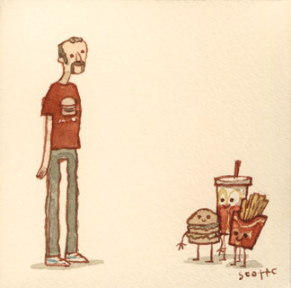
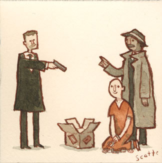
Great Showdowns

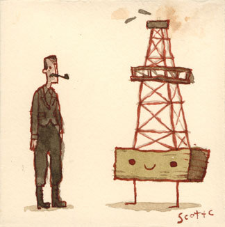
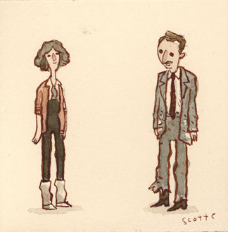
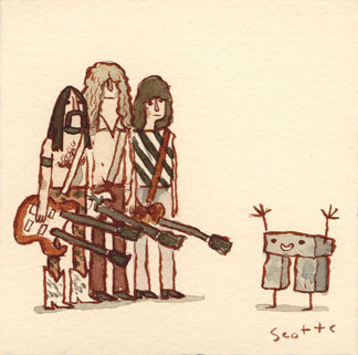 Complexity vs. Simplicity: this is the spectrum upon which illustrators work to best communicate an idea. For me, the work which communicates most efficiently (uses the least to say the most) is also the most effective. Enter Scott C.'s Great Showdowns. These tiny, square watercolors attempt to distill the main conflict or illustrate a pivotal scene from some of the greatest works and cult classics of cinema. They do this with cutesy, tongue-in-cheek humor, making the conflicts seem much more playful than they are portrayed in the movie.
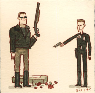
Hitachino Nest Beer


I just started working at a restaurant/bar called "The Hop Haus" off of the brown line, Chicago stop. I've worked in restaurants before and always stole the coasters so it wasn't anything new for me. The other day I was cleaning and found some coasters and started looking for some interesting ones. Obviously the coasters look like the beer label but there was one that I found that was quite small. It's a Japanese beer called "Hitachino Nest Beer". It's been brewed since 1996 and has won tons of awards for the different types of ale and are known for their white ale.
Now working at a bar with all of these types of beer (there's about 30 or so different types of beer that we have) I have to memorize all of them. I found this illustration and thought it was interesting. I tried looking up the illustrator but couldn't find anyone but found a bunch of interesting bottles and designs.
The owl itself has a kind of "South Park" look where it looks chopped and placed, like construction paper. The owl is on every label and seen as a bright red and white on a black background. The words "Hitachino Nest Beer" is typed around the owl and behind a green background. Besides the owl, the labels are all very bright and decorative towards what type of beer they are. Every bottle has the owl on the label in the front as well as the cap. I'm even sure that the glass has an owl on it too or the name on it. In a way, the owl has huge "pupils" (if it did have pupils), and I believe that I get big pupils when I drink which is where the owl's eyes may come from. There's even special labels for holidays, like a special valentines day bottle.
I know there's girls out there who don't drink beer, but from the way that it's described as I bet it'd be a good one for girls to try.
Leeay Aikawa


Leeay Aikawa is a tradition and digital artist, illustrator, and designer, born in Japan and currently living in Toronto. The award winning illustrator for The New York Times, Atlantic Magazine, The Globe and Mail, and more moved to Toronto in 2003 to study General Arts and Science and later switched to Illustration after some self discovering. To her, living and studying in Toronto, a culturally diverse area, has greatly influenced her style and choices in medium. It would make sense that she was into such cut and paste collage art, as she describes the city as being a piece of collage art. All of these different viewpoints, beliefs, and backgrounds combined create an identity for Toronto, similar to how she mixes many different materials to make up an entire illustration, design, or work of art. She states, “I don’t always believe in the concept that Less is more,” she says. “If you do it right, elements as a whole can speak more.” This is compelling to me because I have never thought too far in depth about collaging to illustrate but is now a new style I’ve been considering.
The first image I posted is the cover art Leeay created for the September 2010 edition of The Walrus Magazine. The Walrus is an award winning monthly publication magazine in Canada supporting Canadian writers and artists, showcasing non-fiction, short fiction, poetry, photography, and illustration. On her website she presented the development from her first rough sketches to the final. The cover art was supposed to illustrate a story featured inside, entitled The Boomerang Effect: How Did the Forever Young Generation Turn Into Perpetual Parents?, which she also did an illustration for (second image). The story, written by Marni Jackson, is about a parent having troubles with her 20 year old son’s wished to take time away from school and travel. You can read the story here.
On that same link where she displays her creative process for The Walrus cover art, she also explains color palettes, subjects, and other guidelines she was given for this project. As a student aspiring to be an illustrator, this was helpful to read because it gives a bit of information of what it would be like to take on such a task from a client.
Another example of her work includes her thesis project at Ontario College of Art Design. With this, she illustrated a series of Happy Accident stories. I found these very silly and charming. She has also worked on fashion illustration, and besides working for clients, has dabbled in some personal work with making animation videos with AfterEffects. She seems new at it, but judging by her information pages, she sounds like a very driven person and i think she could go far with some flat animation.
Here’s some more work for her clients:
2010 The Globe and Mail
http://www.theglobeandmail.com/life/food-and-wine/local-food-is-it-good-or-bad/article1502534/
2010 Atlantic Magazine June issue
http://www.theatlantic.com/magazine/archive/2010/06/the-genius-of-qvc/8091/