Friday, February 24, 2012

The symbol of the Eye of Horus

Picture here is an image of The Egyptian symbol of the Eye of Horus. It represents good health, political power, and safety. It was worn as an amulet by those in power (Pharohs and royalty). Interestingly it was used as a measuring device because of its proportion, which are also symbolic in nature. The eye can be split into 6 distinct pieces, pictured here:

These pieces represent the 6 senses (one more than we are accustomed with.

1. Touch 2. Taste 3. Sound 4. Sight 5. Smell 6. Thought

In egyptian culture it also represented the sun while the Eye of Ra represnted the Moon.

The Symbolic Kiss


This image depicts US President Obama and his rival Venezuela's President Chavez. The word "unhate" at the top of this image along with gentlemen's head connected by the lips, clearly suggest acting out the metaphor "kiss and make up!" (thats what I get) But, according to US customs, two men kissing is definately associated with homosexuality. To some, homosexuality is considered a weakness within men, especially ones in position of power. So could this be an attack on either President's prowess, or manhood in general? HMMMMM!

Thursday, February 23, 2012

Sheltered Weaklings

This is a japanese vintage political poster that was made by Takashi Kono in 1953. Here we can see that the big shark is the U.S and the school of fish is Japan. From what I know, the fifties was the time when everyone was recovering from WWII. Here Kono was symbolizing that U.S had control over its territory and was the dominant one during that time. In other words, Kono was presenting the social status of these two countries and where each one stood. Kono was giving the message that Japan couldn't do anything but submit to this idea and be sheltered by the U.S until they were able to become independent and rise once more.

Week 5 SYMBOLISM!!!


The Garden of Earthly Delights is a painting by Hieronymus Bosch from around 1505. To me, Bosch seemed to be really ahead of his time because this triptych contains some of the most surreal symbolism in High Renaissance art. The piece shows three panels, each representing a state of one’s immortal soul. The first panel on the left depicts the beginning of life. Some believe that the left panel represents the Garden of Eden, and the original sin that came with it. You can see the animals in the background fighting, almost as if it is foreshadowing the doom to come. The middle panel shows a wide array of nude people indulging in several sinful acts. This panel also has a huge cluster of symbolism. Whether the figures are practicing sexual performances or partaking in other sinful acts, it is clear that this panel is trying to portray the fall of man to evil wickedness. The last panel in the triptych is Bosch’s interpretation of hell. Some art historians believe that Bosch hid the 7 deadly sins within this panel in a symbolic manner. In this section, animals are depicted torturing and mutilating humans, which might represent the natural evil that is in our world. One could honestly go on all day reading into the symbolism in this painting. It’s almost like a Where’s Waldo in the sense that every time you look at it, you notice something new.

Politics

Here we have a poster that features a man with rope through his eyes, neck, and ears. During the time this poster was made Germany was in the grip of both a massive Depression and the uprising of the Nazis Party. This poster symbolized the politics strengthening control over media, especially relating to politics.

If you want to know about this click the link or watch the film Freedom On The Fence, which is where i got this one from. But it's worth the time i ganrauntee it.

Week 5- Symbolism

itsthemusicpeople.tumblr.com/post/17138853986/i-basically-wanted-to-get-these-messages-across

Hey guys!
So my friend forwarded me this link because he knows how much I enjoy Dr. Seuss and I thought it could create some interesting discussion. I think that as a media maker, especially media that is intended for children, we must truly understand the gravity of our role and produce work that is morally conscious and of valuable substance. One of the main reasons why I love his work is in his genius ability to tell two stories at one time. His witty rhymes are appealing to children's ears while the symbolic meaning of the story is a more grand scale lesson or moral that is taught and a universal lesson to continue to teach. This series of images perfectly and somewhat comically illustrate this idea.

Friday, February 17, 2012

Character Caricature


Here are two versions of my caricature. Both came about out of different perceptions of how I view myself and how my friends say that I have been to act.

The first is a rough anime drawing of myself, many people say i resemble Huey Freeman from the updated installment of Boondocks. I don't know Google it, maybe it's true. But i just thought that would be an interesting thing to draw. The second one is a little more abstract caricature like, but i believe it's probably the most acturrate. I was trying to display the light hearted humor, zany eccentric nature that some people say i have.

Vacation, Alienation, Japanimation, Manga, Conga, Naked Lunch, Hawaiian Punch, Fruit Juice. FOOLY COOLY!

Animation

Here is another video i ran into on Youtube a few months back. It showcases Disney's Multiplane Camera which allowed for a more realistic depth of field in animations. This process was used in many famous animated movies, with Snow White and The Seven Dwarfs being the first of many. Pinnochio, Fantasia, Peter Pan and the Little Mermaid followed. It was also used in a Silly Symphonies short (which we talked about briefly in class) called The Old Mill.

So yeah just something interesting i thought you all (y'all) might want to check out.

Animation Wonder

Hey guys speaking of animation check this out! It's absolutely stunning. Link to video: William Kentridge - Automatic Writing

Week 4 Relationships


Here we have two lovers about to embrace into a kiss, their heads leaned slightly into one another, their bodies posed for the big moment. The background a ball of flame signifying their love. That is the Awesome of the Watchmen. Brain child of Alan Moore, writer and Dave Gibbons, illustrator the Watchmen are considered to be in a league of their own. The Anti Heros of the DC Universe. But what i love about this panel is the illustration, both the style and the content. If you ever have had the pleasure to read the Watchmen novels; I call them novels despite the fact they're comics, they're more than that though, you will notice that many read more like a film. And that was the original point Moore and Gibbons was trying to make. 

I have included a side by side of panels from the graphic novels and from the 2009 film.


Thursday, February 16, 2012

Week 4 RelationShips


I've never been a huge fan of fairy art. However I find this particular illustration pretty interesting. Throughout Nintendo's The Legend of Zelda series, the hero Link interacts with several small fairies. Whether they are showing him the way or healing his hearts, fairies are vital in Link's life. Without them, Link would barely get through his epic quest to save his princess. But personally, I always found Link's fairies to be rather annoying. To me, they were small balls of light that follow Link around constantly telling him "HEY! and to "LISTEN!". The fairy named Navi is notorious for being a nuisance in the Zelda universe. This is why I enjoy this illustration so much. I feel like it is almost a breath of fresh air. The fairy isn't depicted as a small ball of light with wings. Instead, it is personified into an actual female figure. In this illustration, the relationship between Link and the fairy doesn't seem annoying. On the contrary, it seems almost romantic. There seems to be a real connection with Link and the fairy. Many of us know about the relationship between Link and Zelda, but what if there was an unknown romance between Link and Navi? I know...I know...this is starting to sound like Fan Fiction. But I still think that this illustration is a good twist on the Zelda games. The relationship in this piece seems genuine. Rather than merely being a means to an end, the Fairy acts as a companion to Link and there seems to be a real "link" between them. (no pun intended)

Relationships


I am not sure who the artist is. Sorry guys! But I fancy the various texture and shape usage of this composition. The relationship between the flat shapes and the 2D ones work as a cohesive unit to define color and form.

Week 4- Relationships

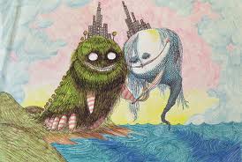
This is an Illustration by Tim Burton depicting Romeo and Juliet. I first came across this image when I went to see his retrospective at the LAMC. Romeo and Juliet is an universal story that everyone is familiar with. I love that he was able to use these characters and portray them in is own style. I have always been really attracted to Tim Burton's work because of his incredible sense of imagination and beautifully fluid line quality of his drawings. This one stood out to me at his retrospective because of the colors used. They are bold pastels which is uncommon among Burton's usual color palette as it tends to be high contrast black and white with pops of yellow or red for an iconic dramatic style that is easily recognized as Tim Burton. I love that they are both fantastic monsters that have the cities probably meant to represent their "two households both alike in dignity".

Week 3-Caricature Yourself!

Hey guys!
So as I approached this project I was thinking of it as self-portraiture. To make it able to be classified as a caricature I thought to emphasize my personality rather than physical features. I often use old medical text books as reference material. I have been currently obsessed with outdated sciences that used physical features as fact to promote their viewpoints such as phrenology.  Phrenology was a science that used to measure bumps on the skull as triggers to identify and explain personality traits. I thought it would be interesting to use this idea to map out my brain according to the interests that consume my thoughts. Its a simple idea and simple drawing done in india ink and water colors but I think it is able to clearly communicate certain aspects of my personality that I like to highlight. Enjoy!

Friday, February 3, 2012

WEEK 2 - Hidden Meaning


The Tour de France is an annual bicycle race held in France and nearby countries. Look closely at the letters "o" "u" and "r" in

tour. They form a figure riding a bicycle. This clever formation of lettering is iconic and also reinforces the message. 

Nicely executed design!

Hidden Meanings in a Classic.

In this iconic image, we see Michelangelo's depiction of the "spark of man." At first glance there's nothing really out of the ordinary; it seems to be a straight forward story. However, upon closer inspection, we find that the image of god and his angels in the distinct shape of a human brain. This is no coincidence, the anatomy is near perfect. Michelangelo was known for for being a renaissance man: architecture, anatomy, art, sculpture... the list goes on. Perhaps his religion was more than church doctrine. He was only a commissionee after all. He may want us to see that god as depicted in Christian beliefs is to him simply the human brain and self consciousness. Perhaps he is saying that is god who gave us intelligence. It's an interesting spin on a classic. Observe:
(Image curtesy of cracked.com) -Dan M.

Thursday, February 2, 2012

Week TWO: hidden meaning


Around the middle of 1990, Entertainment Weekly released a story on offensive artwork in America. Shortly after, rumors began to spread about a lovable sea creature and her solid gold sea-palace. While Disney’s The Little Mermaid told the tale of a young innocent romance, it still created controversy with its movie poster. The cover depicts the movie’s characters in a rather harmless composition, but some viewers believed that the castle in the background was excessively phallic. One tower in particular seemed caused most of outrage in parents and Disney lovers. Some believe that a disgruntled Disney artist, who was enraged about losing his job, put the phallus there on purpose. However, according to Snopes.com the artist didn’t even work for Disney and claimed that the resemblance to a penis was merely accidental. Perhaps the artist’s subconscious got the best of him. Nevertheless, the poster and cassette cover were changed and nothing resembling male genitalia is on there today. It doesn’t make a difference whether this “Penis Conspiracy” is true or not because people will see what they want to see and believe what they want to believe. Anybody can find a “hidden meaning” in something even if it wasn’t there in the first place. This explains why Jesus’s face keeps popping up in burnt toast and in water damaged walls. I don’t think we’ll ever really know what was going through the artist’s mind when he created The Little Mermaid cover art, but whether you see a palace or a phallus, you’ll never look at Ariel the same way again.

Week 2- Hidden Meanings in Images


I did a random google search and came across this website. I thought some of these logos were so intelligent in their simplicity. All of the hidden meanings such as the arrow in the fed ex logo is hidden for the most part until it is pointed out. The one logo that really stood out was the amazon one with the line that implies a smile and an a to z reference. I see it all the time and have never noticed it. Same with the 31 in the BR for baskin robins.