

Thursday, September 29, 2011
Week3
week three

this week i decided to upload an artist's rendition of the mythical monster the wendigo. This piece was ont by devantart user Monkey~Paw and was featured in the Darkson Designs Occult expansion book. it is a digital piece done in paintshop pro using nothing but mouse. I chose this image because i like the texture the artist gave to coarse fur and decaying flesh as well as the detail of the organs in the chest cavity. I really enjoy highly detailed digital art and hpe to one day be able to to do it myself because at this point i'm very clunky when it comes to digital drawing, making things look cartoony and simplified instead of textured and gritty.
Pokemon doodles by Olly Moss

On his blog, Olly Moss describes these drawings of the Gen. I starters as "Some Pokemon doodles I made for no reason". Though there was no apparent reason for this illustration, it still shows plenty of considerations in design and some unique choices in representation. Even though these are cartoon characters, Moss flattens and abstracts them further, removing any organic lumpiness in favor of crisp, geometric silhouettes. Moss livens these figures with some quick, suggestive shading, and creates highlights on Squirtle and Charmander by leaving parts of their figures completely unrendered, to let the viewer' eyes fill in the shapes where the background shows
In rendering the trademark features of each character, Moss strips away anything but the bare minimum of information needed to recognize each character. Squirtle's shell is a fraction of a circle with two black lines, and his tail is a tear drop with a squiggle, which isn't even attached to the rest of him. To render the transition from the rest of his body to his tail would mean including far too much visual information, and create clutter at a part unimportant to recognizing Squirtle. It's also nice how each character's element is subtly shown with the most basic of shapes possible, what with Bulbasaur's feet contrasting against triangular blades of grass, Charmander's flame tail rendered as 3 lemon shapes, and Squirtle's watergun shown as a few raindrop shapes.
Week Two. Ferris Plock

http://www.kefeinc.com/exhibitions/72157627692914596/
Week 3 - Matei Apostolescu (What a last name!)

Matei Apostolescu
Matei is one of my favorite illustrators and graphic artists. He works in mainly digital format and uses very vibrant colors, intricate line work, and psychedelic themes. He also makes figures and toys out of polymer clay and sells them as one of a kind pieces. His art work has been featured on skate, snowboard, and surf decks, digital camera skins, print ads, and many wallpaper websites.
I like his work because his subjects are usually animals, weird human/machine hybrids, space aliens, or just a random assortment of things put together. His style is very unique and I find it very entertaining. You can look at his work as a whole, or you can zoom in on a detailed area and still find either very entertaining. I think he blends colorful art with trippy art without being too overbearing. All of his work has a very fresh and clean feel to it, even though most of it is very intricate and detailed. He currently sells prints of his work, sells his toys, and sells bags and purses with his designs.
week 3 - tangled?
 so.. someone told me this is from tangled.. and i guess maybe it is. i however thought this image was a bit more general then that of the movie, i have seen many images of floating lights in the sky over a kingdom. but i can also see that with the 2 people in the boat, that it is very much a scene from the movie. i love this image anyway because it comes off as concept art. and like everything else i have been posting, concept art is my favorite. the ability to put your ideas down and then make them into reality from that drawn image is amazing. and while this may have been the concept for a movie, and the scene in the film is the final creation brought to reality, i think you can look at this and see many other realities that can come to life. a setting for a broadway play, or a place at a theme park, maybe this is a real place, or somewhere you have once been in a dream. i think the color is great and i even love that far away its a great image, and up close you can see some of the fuzziness that makes up the lines and shapes, which normally i hate, but find relaxing in this image.
Week 3 ~ OBEY

These are a few pieces made from the infamous-influential street artist Frank Shepard Fairey. On the left is his famous "André the Giant Has a Posse" Obey sticker campaign and on the right is Barack Obama's "hope" poster for the 2008 presidential election. I first stumbled upon his work when I was looking through Columbia College Library art books. There were two books that had pages and pages of his work describing his life and how he came to be who he is now. It was an interesting insight on how unknown graffiti artist become so famous when their artworks were vandalism. I was drawn to his use of bold red and white use of colors and meaning behind his work. They were simple and clean. I was surprised to find one of the Giant Obey sticker off the CTA redline Belmont stop. You can see it on the upper right hand corner of a near by building in front of the station. I have never noticed it until earlier this year while riding back home from work even though I have gone past the Belmont stop many times in previous years for school. Now when I get off at Belmont, it's hard for me not to notice it because it's right in front of you while your waiting for your train.

Week 3 - Ben Heine

Ben Heine is a Belgian artist, most known for his “Pencil vs. Camera” series. I came across his work while using Stumble Upon. The example of his work that I chose is from this series. I find it really cool how he combines the techniques of drawing and photography, and does so in such an interesting way. It would still be a great piece of art if he were to draw what he sees exactly and incorporate that into a photo, but he adds touches of imagination and humor along with his realism. His website is worth checking out. He has a lot more images from this series, as well as other works in other styles and mediums. There are also interviews on his site where he talks about his process for his Pencil vs. Camera pieces. Here’s his site:
http://www.benheine.com/index.php
Check it out!
Week 3: German Woodcuts

For this weeks blog I decided to do it on German woodcuts from Medieval times. I don't know the artist but really it doesn't matter, any woodcut I am drawn to really. When it comes to illustration or just art of any kind I really like thick black outlines and you can see that type of line work in these old pieces. The varying line weight is another aspect of it that I enjoy too. Though the process and final product is more of a print making technique it all started with a illustration so I see it fitting for class. Here is some more information just on woodcuts themselves: http://www.loc.gov/exhibits/heavenlycraft/heavenly-15th.html
Week 3 - Aubrey Beardsley


I chose Aubrey Beardsley as my featured artist for this week. His style of illustration is one which has certainly caught my eye in the past, however until recently I didn't know his name. Beardsley's illustrations were greatly influential in the Art Nouveau period. His precise line work accentuates the main points of interest in each composition. Alternating between ornate detail and sparse minimalism, Beardsley's lines are essentially used to emphasize form. There is a kind of quality in his work which captures the romanticism of England in the late 1800s. For this reason, his work is wonderfully suited to accompany the writings of Oscar Wilde. I am personally a big Oscar Wilde fan, and so when I saw these great illustrations that went hand-in-hand with his writing style, I was instantly a fan of his work. The images I chose to show here demonstrate Beardsley's humor as well as his technical ability. The image on the left hints at comic-book styles and even surrealism. A link to more of his work is below. There's no official website or anything since he's from the 19th century but just Google image it if you're interested... its great stuff, I love it...
http://www.loyno.edu/~history/journal/1992-3/smith-e.htm
Week 3 - Cliff Richards
 So I had wanted to post a zombie illustration since I had started watching The Walking Dead last night so in searching for images I can across this one. I thought it was great because it takes the classic Jane Austin book Pride and Prejudice to new extremes with changing the story line to incorporate a zombie outbreak. The sketch style is kind of rough and the shading is done by using smaller lines and crosshatching. This illustration really intrigued me because you see these elegant women from like the 1800's that have pulled out daggers and just have expressions upon their faces that are determined to do whatever they need to in order to survive. These women have turned from well-mannered ladies to badass zombie killers. Behind the main two women up front you can see others in the back that have slit a zombie's throat or put a dagger through one's head. These women clearly will defend their lifestyle and belongings to the fullest extent. For some reason I can even picture them after slaying all the zombies sitting down to have a cup of tea and chit-chatting while the bodies and bloodied mess surround them. I am pleased with the illustrators style and making all the different bodies stand out even though their is no color. He does this by the weight of his lines and their spacing of one another. The only thing i would change with this illustration is how some of the bodies have seemed to run off the page. This doesn't bother me so much on the bottom but on the sides it seems to just end too abruptly for me, especially on the right side. I would like to see what the woman on the right in the back is doing exactly.
http://www.oprah.com/omagazine/Pride-and-Prejudice-and-Zombies-Illustrations
http://vic-sanborn.suite101.com/pride-and-prejudice-and-zombies-the-graphic-novel-a242760
Week 3 | BLU


BLU is just another talented, infamous graffiti artist, but what I like about BLU is his incredible graffiti stop-motion videos he creates. After stumbling upon his youtube video 'MUTO,' I've been following this artist's work for almost two years. Not much is known about BLU, except he's from Argentina and travels the world creating massive murals on huge walls for everyone to see. The one above was done in Barcelona.
According to wikipedia (a very unreliable source) he's been active since 1999. He's done a few collaborations with other famous artists which are also up on Youtube. I've noticed his style evolve into more social and political work. Sort of like Banksy's stuff. A very short and sweet, sarcastic way of taking a stab at the world's problems
here's MUTO.
- Javi
Week 2 LATE | Ken Sugimori

I think one of the most influential artists of my childhood is Ken Sugimori. Sugimori made the illustrations for the first 151 pokemon of the original series himself. He's also worked on many other franchises such as Super Smash Bros. and more recent pokemon series. I still remember getting my first pokemon card at a garage sale in the 4th grade. It was a charmander. I remember reading the different artist renditions of all the pokemon cards. I was engroessed with all the illustrations on every single card.
I still sometimes look through my pokemon card album (yes, I still have all my cards) to get inspiration or just look back at all the time I put into collecting all 151 pokemon cards.
- Javi
Week 3 - Carly Waito

This piece was done by Carly Waito. When I first came across her oil paintings I was really impressed! I was impressed for 2 reasons: 1.) For a second I thought I was looking at photographs of minerals and gems but I was wrong! 2.) She's the only artist that I know of that creates paintings like these. I never seen anyone attempt to paint minerals before. I love ALL her artwork because you can tell that she focuses on detail. Throughout her work each gem/mineral that she paints always look realistic and has this photograph look to them. Each one has so much color and detail and shine, it's kinda hard to believe that someone could actually make these type of paintings out of oil paint. It seems like it would take a a lot of time and energy just to complete one! Imagine trying to paint every single line or crack that you found in a rock. It's amazing and I wouldn't mind owning a piece of Waito's work one day.
Feel free to check out her website:
and her blog: http://carlywaito.blogspot.com/
Wednesday, September 28, 2011
Week Three - Alex Ross
 The artist I chose for my week three blog post was Alex Ross. Considered to be the "Norman Rockwell of comics", Alex went to the Academy of Art right here in Chicago for college. He studied classic American illustrators like Rockwell and J.C. Leyendecker to achieve a hyper-realistic look to his work. I found this quote on his website explaining what goes on in his mind as he illustrates: "hopefully by painting the work, you gain a sense of life and believability that will draw the reader in a little more. You can use color and light and shadow and live models to give the work a certain realism. It might be easier to relate to a character if you look at it and say, ‘Here’s an actor portraying someone. Here’s something that looks real.’ I thought it would draw people in and maybe add to their enjoyment of the work. There’s also a part of me that likes to speculate: ‘What if they made a movie about this character?’ I realize some of my favorite characters will never get the movie treatment, so it’s up to me to present them in a lifelike fashion, to make the movie that would otherwise never get made." More information and illustrations can be found on his website: http://www.alexrossart.com/index.asp
Propaganda in fiction, 19XX poster/cover art
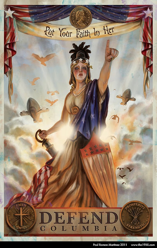 This lovely piece was created by a Graphic designer out of Ventura CA for his web-comic adventures of the 19XX. a comic set in a steam-punkish alternate America. When I first saw this on an image hosting blog I assumed it was related to Bio-shock Infinite (a video game who's planned to be released within the next year or so) but I was surprised to find out it was of it's own world, that of 19xxad.com the imagery of a Columbia crying sword in hand is a striking one if you'r familiar with early twentieth century propaganda. Colombia was simply put, Uncle Sam's female counterpart and had been featured in a number of posters during WWI, asking for war bonds and service of course. Her name is derived from that of Christopher Columbus, the man thought to have discovered and colonized North america. The name is used for many institutions such as our own Columbia college of Chicago. She is used here in a propaganda piece that shows us some of the values and ideals of this fictional world the writer and artist asks you to step into. With buzz words like faith, unity, prosperity, and strength and the images of zeppelins streaking across the air we begin to get some idea that this is a world like our early twentieth century but not quite, things seem a bit off. please do check out the site its an oddity as a serious web-comic and the art, of what I've seen of it, is pretty good. If you're wondering if this is a ploy to capitalize off of Bio-shock infinite's upcoming release, I wouldn't know, but it is wetting my whistle for the eventual release of Irrational games' game next year.
Week 2

This illustration is part of a concept art series for the video game Half Life 2. I chose it because it is a series in which the artistic process from the original game has evolved heavily, while also becoming very rich in its story and design elements. In particular there have been consistent characters in the game (bad guys, good guys, etc.) that have undergone considerable development. This illustration seems to be a lot more digital than other examples of Half Life concept art. The character here is the games protagonist, Gordon Freeman, wielding his infamous crowbar down upon some inter-dimensional alien's dome. The main concept artist for the series was Ted Backman, but I'm not totally sure that he did this illustration. Either way, the combination of the story and art creates a brilliant game that feels more like a movie at times. The stark background really pulls your eye into the center of the piece and the intensity of braining something with a crowbar.
Friday, September 23, 2011
WEEK TWO-ShoboShobo

(link)
Week 2 - Concept Art

Week 2 Danny Allison


Danny Allison is an illustrator based in the UK. I chose him because of the mixed media he uses. I see ink lines and paint and photography. I like being able to see the process of art making.
Allison's work is rough, but very purposeful. For instance the Galileo picture. The black charcoal markings are scribbled and unfinished. The planets in the background are photos, but highlighted with rings of paint. And the stars are airbrushed. All the different media are used to show the brilliance and discovery of Galileo's work. Another great example is this Mike Tyson illustration too. All the ink and paint and airbrushed qualities, show Mike Tyson as this crazy and wacky character.
Although Allison has a rougher aesthetic, he pulls it all together very well. The colors resonate off page. All the media he uses may not be clear right away, but the purpose of the artwork is easy to recognize.
Thursday, September 22, 2011
Uno Morales

This week I chose horror artist Uno Morales not only for the sense of ineffable dread that can emerge from viewing his moody surrealist scenes, but for his rendering method, which hearkens back to 1-bit black and white computer displays from the 80's. Morales has more work in color on his website (here), but this black and white image more clearly showcases Morales' style. Back when bitmap images were 1-bit, so that each pixel literally could only contain one bit of information (whether the pixel is pure black, or pure white), artists and technicians who prepared images for the computer had to work around these technical limitations to include shading and the illusion of different values. For photos they used dithering, and for graphics and illustration they would use more traditional crosshatching and Ben-Day dots, albeit in a very low-res format and stiff style.
The end result of such a procedure, as shown here, looks both primitive and mechanical, two attributes which have the potential to horrify. The conspicuous black and white pixels remind you of the fact that what you are looking at might have never been committed by pen onto paper, and is merely an arrangement of data meant to trick you into seeing something. The splotches of mechanically drawn crosshatching provide a raw, sort of irritating form of stimulation.Also, another note: You might notice this image is a gif. The artist has subtly animated the image to make it look like you're viewing it on an old computer screen prone to magnetic interference, which I think is a nice touch.
Week 2 - Olly Moss

Olly Moss
Star Wars movie posters
Olly Moss is an illustrator and graphic designer from the UK. I chose him because of his unique style and because he frequently designs things that interest me - political posters, retro re-designs of video game covers, and these Star Wars movie posters. Each poster has an outline of a character, then on the inside it depicts an iconic scene while using the environment to give greater detail to the character outline. The characters and scenes he picks are iconic to each film. It's so simple yet ingenious. "Star Wars: A New Hope" features C3P0 as the character and the famous Tatooine double sunset as the scene. "The Empire Strikes Back" shows Cloud City which makes up the visor for the bounty hunter Boba Fett. Lastly, the "Return of The Jedi" poster has the forest moon of Endor's tree branches twisted to form the details of Darth Vader's helmet.
Most of his other work is similar to this. He uses subtle details and a minimalistic approach to most of his work. His work is generally flat looking and usually is used in print like these movie posters, band posters, magazine illustrations, and print ads. His work is very clean and he sometimes integrates "retro" style into his posters. This gives him a very fresh style. Contemporary illustration mixes old and new culture, high amounts of information depicted in the most simple way possible, and qualities of hand-drawn and digital artwork.
Albert Einstein once said, "Any intelligent fool can make things bigger and more
complex... It takes a touch of genius - and a lot of courage to move in
the opposite direction." I think this quote sums up Olly Moss's body of work. Everything is simply stated. Moss does not need complexity. His work is refreshing and relaxing to look at.
Week two. Assassin's Creed

This is a photo of a piece of art done by Mahiro Maeda, formly of studio Ghibli and currently a very prominent director and character designer of Gainax that was exhibited in Tokyo's Spiral Garden gallery for the Assassin's creed art exhibit. For those who don't know Assassin's creed is a game that takes place in renaissance Italy. The artist chose to do this piece in that very recognizable renaissance renaissance cannon and is formatted like a stained glass window. Each panel tells part of a story. Maeda chose to portray the historical figures in the way they were portrayed in the art of their time instead of how they looked in the game. If you looked up art of Rodrigo Borgia (Pope Alexander VI) that's how painters painted him as.
JUNKY cover art

This is a graphic design piece and an illustration piece for the cover for the 50th anniversary edition of William S. Burroughs' breakthrough novel "Junky". The book quickly summarized is a detailing of Burroughs' experiences with Junk, or heroine, as well as many other drugs. The cover communicates this theme of drugs with the syringe symbol with a caricature of the artist's face in the center. the yellow color is off center, like a poorly registered print making the syringe a bit more ambiguous. My favorite bit is the needle itself that appears to be drawn with a steady brush stroke that ends so perfectly in a tear drop shape that echoes that of liquid dripping from a syringe needle. The artist is Credited to be Neil Powell who hand lettered the 'Chinese rocks' like typeface. The book was republished and distributed through penguin group. For more info on this design go to
Week 2 ~ Street Fighter Skate Decks
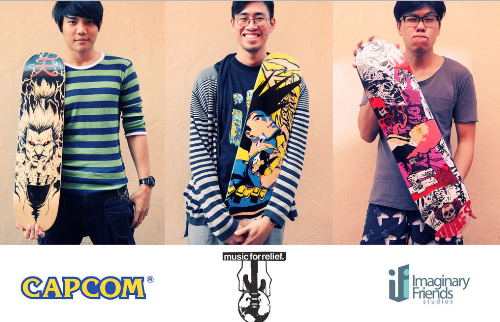
In celebration of Super Street Fighters IV Arcade Edition, Capcom enlisted Imaginary Friends Studios artists to create designs inspired by the game on skate decks to benefit Music for Relief's Japan tsunami relief effort. The photo above shows three of the nine boards that were being auctioned.
I have always been facinated by skate deck illustrations when I started getting into skateboarding a couple years ago, but never got the chance to look more into them and nothing quite like these. When I first came across this photo, I was just amazed at how these artist were able to paint these Street fighter characters onto these boards so polished and clean. Each one of them had a unique feel to them and that gave a "bad ass" look. It really inspired me to give it a try someday and illustrate one of my own boards. It was also heartwarming to see artist, like these guys, be able to help the community with their art. I did something similar in high school where we held an event called "Empty Walls" where art students and guest artist would come in and draw all day until it was time to aution off the art to help raise money to fight cancer.
Website:
Music For Relief Website
Full View of Photo
NMRosario - Week Two
 I decided to choose different topics each week for our 15 illustrations/sketchbook assignments. The topic I picked for week two were illustrations that came solely from Mens Health magazines. Basically, because I had old issues laying around that I could rip up. I never realized how many illustrations Mens Health had in their issues, there were quite a lot. Some of them were really cool looking but none of them were interesting enough for me to post on here. Since my week two topic was based off Mens Health it got me thinking about body proportions in comic books and how exaggerated they can be at times. A few weeks ago I was looking around on Deviant Art and came across this illustration of Beast (from X-Men) by the artist Nathan Rosario. This is one of my favorite renditions of Beast I've seen. I also came across a great tutorial by the artist which is helpful for those who want to learn how to color their artwork using Photoshop: http://nmrosario.deviantart.com/gallery/?offset=24#/d2p6vr8
Week 2 - Conrad Roset

I found this artist Stumbling. I found his website through a couple of links, and picked this image out of his online galleries. It is from the same series as the images that I originally saw, but this one stood out to me. It has more color than most of his other pieces in this series, and I found the pose of the figure more interesting. I was surprised to discover that I really love this style. It’s not the kind of illustration I usually look at, so I’m glad I happened to come across it. Conrad Roset is from Barcelona, and he has done work for many companies, including Coca Cola and Adidas. He has a large amount of work on his website, conradroset.com. You can view both personal work, which this piece is part of, and commercial work. Some of his ad work looks more finished, but I prefer the unfinished quality of his personal works.
Robert Williams

Robert Williams is yet another artist who got his start in the 60's underground comics scene and moved on to become very well known and respected for his work. He is a painter as well as an illustrator whose acid-drenched work contains overpowering amounts of detail and color. He works most often in the Surrealist tradition -- seamlessly mixing the ordinary with the extraordinary. This creates a kind of dream-like atmosphere which Williams crams with living substance from the conscious and unconscious mind. Much of his work deals with the darker more twisted side of the "American Dream" which has become so over-saturated and over-stimulated by media and culture (or lack thereof). I really like Williams' work because, looking at it, I can get a sense of the endless fragments of information which I take in (knowingly or unknowingly) every day and see them laid out and piled up in detail.
A lot of Robert Williams' work exaggerates archetypal sensual pleasures such as hot rods and beautiful (usually scantily clothed) women in provocative positions. He exaggerates them until they become comedic; often putting side by side elements from life and fantasy -- all swollen, sensuous and raw -- like looking in detail at the artist's Id.
In recent years Williams founded the art and culture magazine Juxtapoz which has become quite successful and popular in the art world. I would highly recommend Williams' work to anyone interested in the absurd and surreal. He is most certainly one of my favorites. A link to his website is included below:
http://www.robtwilliamsstudio.com/
Week2-Books of Adam
 I chose this image for this weeks blog because I just thought it was so damn funny. My friend sent me this link on facebook saying that it reminded them of something that I would do and its true. This artist is kinda like the one I posted last week in that they also take images and change them to their style though this one is more simple. I just am so inspired by the simplicity of it all, you can still look at the original picture and look at the doodle and see how they are the same but at the same time they are so strikingly different. The simple lines in the face to show the details and I wouldn't say 'grossness' but their style of cartooning really draws me to it. Also I just love that dog in the picture. Its so fuzzy! Here is a link to more of their work, you can even get your own portrait: http://adamdraws.bigcartel.com/
Week 2 - Holton Rower

So this piece isn't strictly pencil and paper work BUT I figured I would show you guys because it's pretty awesome. Plus it caught my attention and I just want to share! This was done by artist Holton Rower, and every time I look at the video clip and just watch the whole process of creating paintings like these, I'm always amazed and then I think to myself, why didn't I come up with that first?! It's just such a brilliant idea. I really love all his paintings because they look really trippy and he's clearly not afraid of using every color. I noticed that all the colors that he uses work well together to create this really organic shape. It sorta looks like a deformed cross towards the center but once you look at the whole thing it makes this odd blob shape! I personally think that he uses thinned out acrylic to make the colors bleed smoothly down the plywood and I also love the fact that none of the colors ever blend together, instead they form these wavy lines.
To see the process click the link below. Enjoy
Check out his website here: http://holtonrower.com/
Wednesday, September 21, 2011
CRUMB -- LATE

Robert Crumb (R. for short) is an "underground comics" artist who began working in the mid-to late 1960s. The image I chose to represent him is one which I originally saw in a book (which is its proper context as opposed to online). While Crumb has done vast amounts of self-biographical narrative-style comics for which he is most well-known, he is also an accomplished illustrator who is wonderfully adept at bringing text to life. This image is from a book produced by Crumb and Zane Mairowitz titled Kafka. It is essentially a short illustrated biography of the writer Franz Kafka. Crumbs work is particularly suited to illustrating Kafka's writing as it is often grotesque, explicit, and highly stylized. The viewer can see the obsessive line work which utilizes hatching and very high contrast to create an image that really "pops" off the page. It conveys a potent sense of neurosis which disturbs some people, though I think it is brilliant.
Crumb uses mainly pen/ink and rarely (most likely never) uses any form of digital imaging -- another trait of his which I am quite fond of. This piece is a great example of Crumb's work because it showcases his ability to visually represent a feeling in a striking way. A look at Crumb's other work will reveal more violence, sex, and primal emotion shown in ways that make the situation, however explicit, seem somehow funny -- or at least palatable . The Kafka book contains some of my favorite illustrative work by Crumb because it shows that he really felt a sort of kinship with Kafka in the sense that they are/were both sensitive artists tormented by inner demons as a result of family issues and societal conventions. I would strongly encourage anyone interested in illustration to explore Crumb's work if they have not already. Below is a link to his website and some of his work.
http://www.crumbproducts.com/
Monday, September 19, 2011
Week One. Forest Phantoms. LATE

Friday, September 16, 2011
Post for last week, a selected page from the adventures of Dr. Mcninja
 The Adventures of Dr. McNinja is a web comic by Christopher Hastings (writer and artist) and Anthony Clark (artist). The comic is possibly the funniest full color comic book style comic available on the interwebs and features some pretty good art. You can read over fifteen story arcs featuring the protagonist Dr. McNinja at http://drmcninja.com/ each of which ranges from 20 to 100 pages long!! That's a lot of free comic. I suggest you start at issue 1 page one, a few of the jokes are dated but you can really see the team progressing as a team if you flip through various story arcs. The reason why I chose this particular page and part of what makes The Adventures of Dr. McNinja so great is the perfect comedic timing, which is something incredibly difficult to capture in sequential art. I can't tell you how they do it but these guys make me laugh every (metaphorical) turn of the page. Please do check it out.
Red in his room (Artist unknown)

Google's reverse image search didn't give any clue about the original artist or title, but this piece still has a lot to talk about. I really like the composition here. The diagonals that it uses really encourage your eyes to move around the room and soak in the details. The bed, the desk, and the back shelf thingie all form their own level, and contain a lot of little trinkets and doodads that reference Pokemon--both merchandise that exists (or could exist) in real life, and things in the games (Pokeballs, Pokemon league trophy) that exist in their fictional world. This has the effect of making the room look really lived in (and details like the little magnets on the desk are a nice touch which adds to this verisimilitude).
The sophisticated 3-point perspective seems to have relied upon a photographic reference, which adds to the effect of this being a candid snapshot of a moment that could've really happened, as opposed to something staged or posed. This is an interesting direction to take for an illustration of a boy sitting with three superpowered videogame creatures. The way Charmander raises his flaming tail even as he sleeps under a bit of Red's blanket really makes him seem like a living, breathing, creature. The casualness and spontaneity with which such extraordinary subject matter is treated makes it seem a lot more real, which is something I know many in my generation have wished for one time or another.